Case Study for Corner

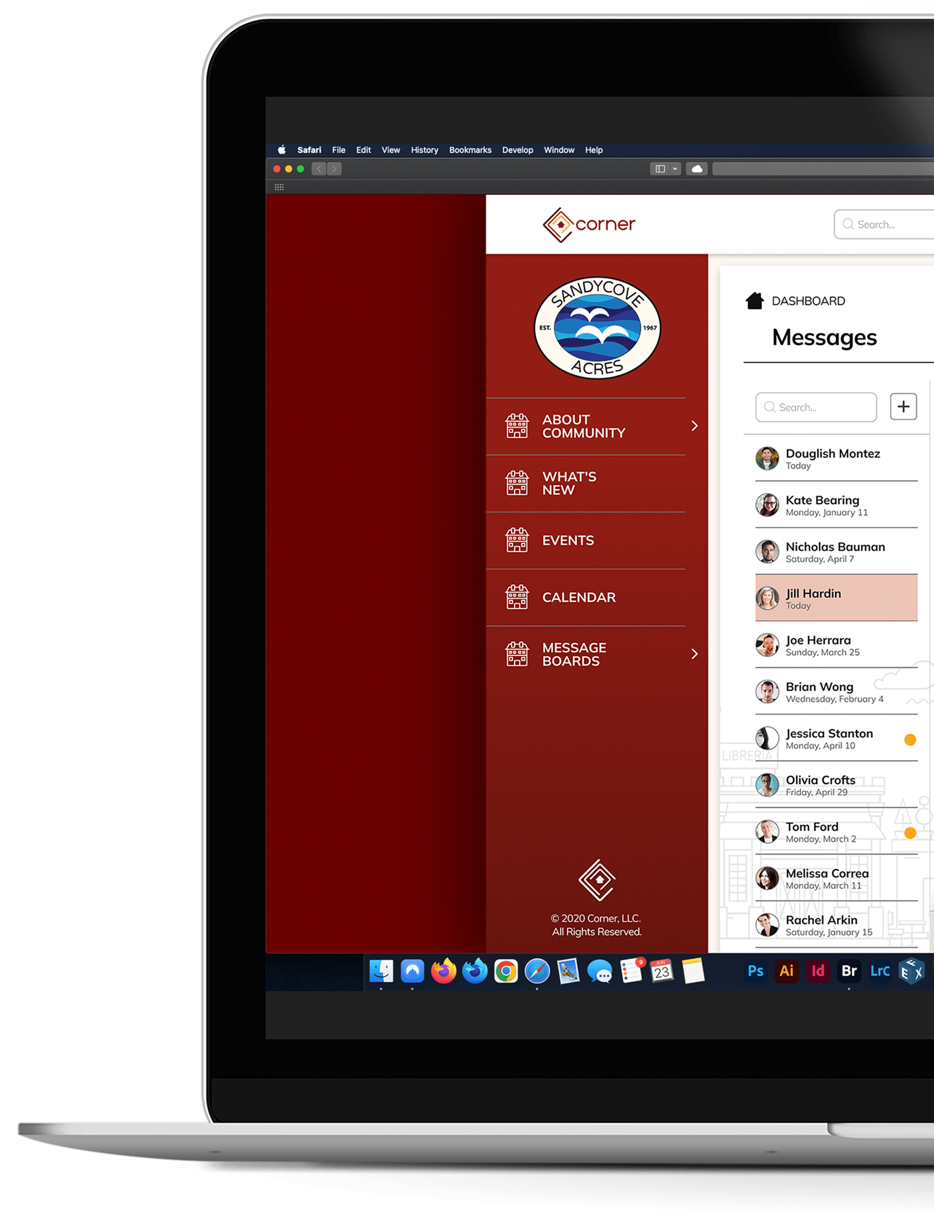
Corner is a new conceptual web app that brings homeowners together and gives them a place to connect, manage and enjoy the community they are part of. It gives users the ability to become part of the conversation about their neighborhood and allows them to take control of the part they play in their community.
- UX Strategist
- UX Researcher
- Content Strategist
- Information Architect
- Visual Designer
- 6 Weeks
- Mike Marin (solo)
Case Study for Corner

Corner is a new conceptual web app that brings homeowners together and gives them a place to connect, manage and enjoy the community they are part of. It gives users the ability to become part of the conversation about their neighborhood and allows them to take control of the part they play in their community.
- UX Strategist
- UX Researcher
- Content Strategist
- Information Architect
- Visual Designer
- 6 Weeks
- Mike Marin (solo)
Project Scope
Moving into a new neighborhood isn’t easy. Whether it’s a new apartment or new house, you are now moving into an entirely new community. This can come with struggles and challenges that some people are not sure how to handle. They want to connect with their community and so they start looking for local groups and events happening nearby. However, their local board or management groups may not provide a platform for residents to participate in. What better way to ease someone into their new community than by giving them a place where all their groups and people who want to connect can gather.
Goals
- Secure sign-up and login for residents and management teams with their own dashboards.
- Community pages that can stand in as the community website for general viewing.
- In-app messaging system for neighbors and management teams.
- Unique message boards for neighbors to connect or securely input community violations.
Challenges
- Understanding experiences and obtaining actionable feedback from real people.
- Coming up with an MVP that was detailed enough and hand enough features to be useful.
- Designing an application for both desktop and mobile.
I used the Design Thinking process to work through this project.
Problem Statement
The initial idea for this project was to develop a way for homeowners, renters, HOAs and leasing office personnel to connect with each other in a well organized and secure application. The main goal was to create a space that brought together all the best elements of an HOA website, social networking platform and the feeling of community connection.
User Survey
After researching competitors and gaining an understanding of features that were being implemented, I started planning my User Survey questions to help discover information about my target audience. I wanted to know why users would be interested in using my web app and what types of features they would want.
The Survey was given to 26 participants over 48 hours.


25-35
I structured the questions to learn:
- A general sense of user technical aptitude.
- What types of living situations users are in and what their feelings are about them.
- How do the people surveyed feel about the level of community involvement in their own neighborhoods.
- How people generally research new homes and new communities and what they consider important.
- What the expectations are of an HOA run community.
- What features are important for a user to see in the web app.
Some key data points were:
- 61.5% of users were heavy tech users that leaned on applications daily.
- 66.7% of users owned their own home.
- 48.1% have lived in their current location for up to 3 years.
- 44.4% of people plan to keep living in their current home for another 1-2 years.
- 37% plan to move into a new-home-to-them for their next living situation.
- The majority 55.6% of users surveyed were between the ages of 25-35.
While the purpose of the survey was to gauge general information from potential users, it was also used to propose feature ideas for the future app. I learned that most people who might use it generally own their own home and plan to stay there for at lease another 2 years. They tended to be young and new to owning a home so they wanted an engaging online experience where they can interact with their community online.
Course Correction
After reviewing the results from the user survey, I took a serious look at the original problem I was trying to solve. I drew from personal experience moving into a new home and new neighborhood, with the hope that, in some way, it would give me access to some sort of ‘special’ community or group of friends. I put that responsibility on our local HOA and looked for better ways for neighbors to reach out to each other, if only at a digital level.
What I ignored in the original idea was my previous experience as an apartment renter. I thought “why should I exclude them?” I’m sure there were people that wanted to connect with their neighbors but lacked the motivation or knowledge on how to make that connection possible. Why believe that, just because they were a renter, that meant they wanted to be left alone and unaware of what was happening around them?
The survey direction pointed towards those who may move into a community and had expectations of an HOA community. Not everyone was willing or able to move into those communities so why not expand on the original idea to make it more inclusive? I could apply what I learned to reach and potentially be more beneficial to a wider audience.
Competitive Analysis
The Competitive Analysis became the foundation for this project. My aim was to identify three competitors that utilized features like community information, social networking and user interaction.


With an idea in mind, and awareness that social media is a strong way to bring people together, I chose Nextdoor, Facebook and HOA websites as competitors.
These sites all have similar features that are showcased in different and unique ways. All three have a web app and a mobile app version of their sites.
Putting together flowcharts would showcase how each platform handled common tasks. I would be able to use the data as a reference for similar implementation. Also, I selectively chose the best features of each competitor and planned to build them into a strong online neighborhood community.
User Personas
While performing my User Surveys I established that the two biggest age groups were ages 25-35 (55.6%) and 35-45 (33.3%). Of those two demographics, three main types of people were more readily apparent; home owners, renters and management personnel. Filtering down the data into these three different personas gave me some insight on what types of features I should be considering.
Small Business Owner
Age: 34| Location: Seattle, WA | Sex: Female
Business Owner
"Living in a great community means having the freedom to participate in activities or not, but still have a feeling of connection to those around you."
- Olga
Motivation:
Olga wants to succeed in life and part of that success is being a strong role model for her daughter. She tries to give her teachable moments while out in public. It frustrates her that, although she advocates for being a friendly neighbor, the same is not reciprocated. She excuses it to her daughter as people being naturally suspicious of one another due to technology. Her daughter isn’t capable of understanding that the phone her mother lets her play with also plays a part in society’s disconnect from one another. Olga hopes to find a way to connect with those in her community more easily.
Goals:
- To be well informed about happenings in her community.
- Being a good neighbor and assisting those in need.
- To do her part and contribute to the cleanliness and safety of her neighborhood.
- To feel part of something whole instead of an individual in a sea of strangers.
Frustrations:
- Not connected with community.
- Doesn’t know neighbors very well.
- Hears of events in community too late to participate.
- Pleasantries given to neighbors are not reciprocated.
- Community HOA site infrequently updated, despite Olga paying dues on time.
Renter
Age: 25 | Location: Lincoln, NE| Sex: Male
University Student
"I don’t go knocking on my neighbors doors because I have no interest in knowing them. I wonder why they introduce themselves to me. Are they really interested in knowing me?”
- Chen
Motivation:
Chen knows there is a time and place for everything. He attends an expensive university, studying for a demanding degree and knows this isn’t the time to try fostering relationships. He’s not a bad guy on the inside, but believes that he’s not going to meet anyone in apartment complex that he’ll still know in a couple years. So he lives life with that expectation and chooses not to engage with his neighbors. In spite of his behavior, even he likes to come up for air once in awhile and have the chance to engage with his community. That just requires more work than he is prepared to do.
Goals:
- Focus on being a student is number one priority.
- Being a good neighbor means keeping to themselves.
- Responsibility of community cleanliness is the problem of others.
- Would be nice to know if other students are living around him.
Frustrations:
- Overly friendly neighbors.
- He might want to participate but doesn’t have time to seek out groups or events.
- Neighbor should leave him alone when he plays music loud outside his balcony.
- He doesn’t consider himself a rule breaker, but he doesn’t know where to find the rules of his community.
Property Manager
Age: 42 | Location: Los Angeles, CA | Sex: Male
Leasing Office Manager
"I love contributing to my community whenever I can. I just wish it wasn’t so much work to include and inspire others to do the same."
- Sebastian
Motivation:
Sebastian works hard to be at the top of his game in his job. Doing so encourages his tenants to be happy and content with their home surroundings, and more likely to accept small changes and rules in the building. When tenants show up at events he’s curated just for them, he attributes that success to people caring for one another. In his home life, he is the same way. He knows that many people aren’t great organizers or facilitators of relationships. They may not know how to speak to each other, and with the advent of technology people are engrossed in digital means more than reality. If he can utilize technology properly, maybe he can increase his success in both his home life as well as his professional one.
Goals:
- To enjoy life in a safe, diverse and informed community.
- To provide a level of support to his community that ensures that he does all he can to contribute to his vision.
- Enjoy time with his family and meet new people in his community.
- Help create opportunities for community involvement with new and existing people, both in his professional and personal life.
Frustration:
- Web development on his sites are unreliable and typically quick to go out of date.
- His tenants struggle to keep up with basic maintenance of their property as no one told them what to do.
- Lack of consistent results from usage of different apps gets confusing at times.
- Organizing neighbors and tenants for community involvement can be tough due to people being on different pages at all times.
User Flows
Taking into account how many tasks were initially considered for this web app, setting a priority helped to narrow down the important tasks that were essential for basic functioning. Next came the planning on how to complete each task by mapping out the user flows. Because this app is being developed as a web app I had to take into consideration the mobile viewport as well as the desktop which doubled the work in the end.
Here are the 5 user flows that I chose to work with.
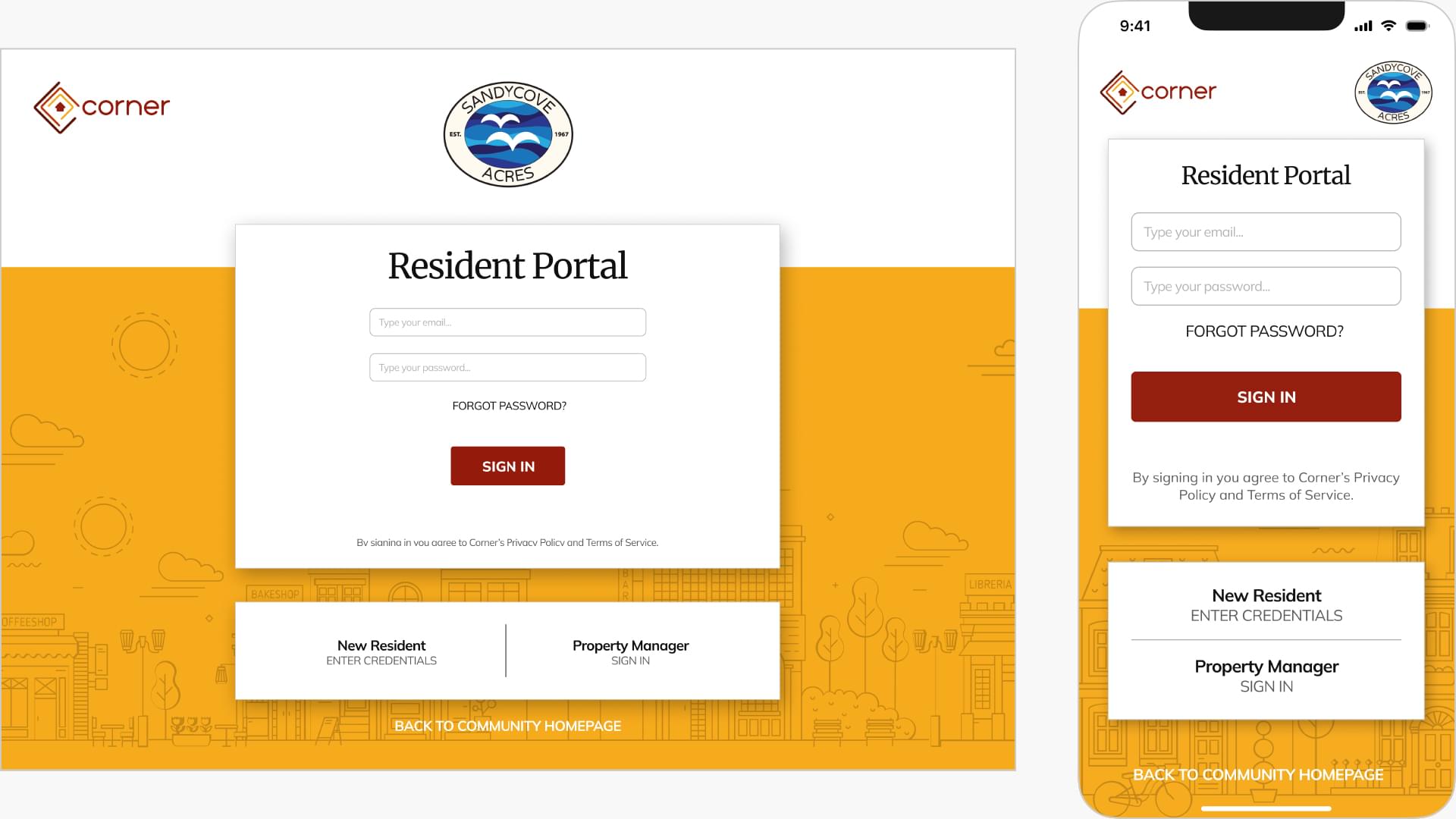
- Login with a username/password panel so users can access the app for the first time and start the registrations & validation process.
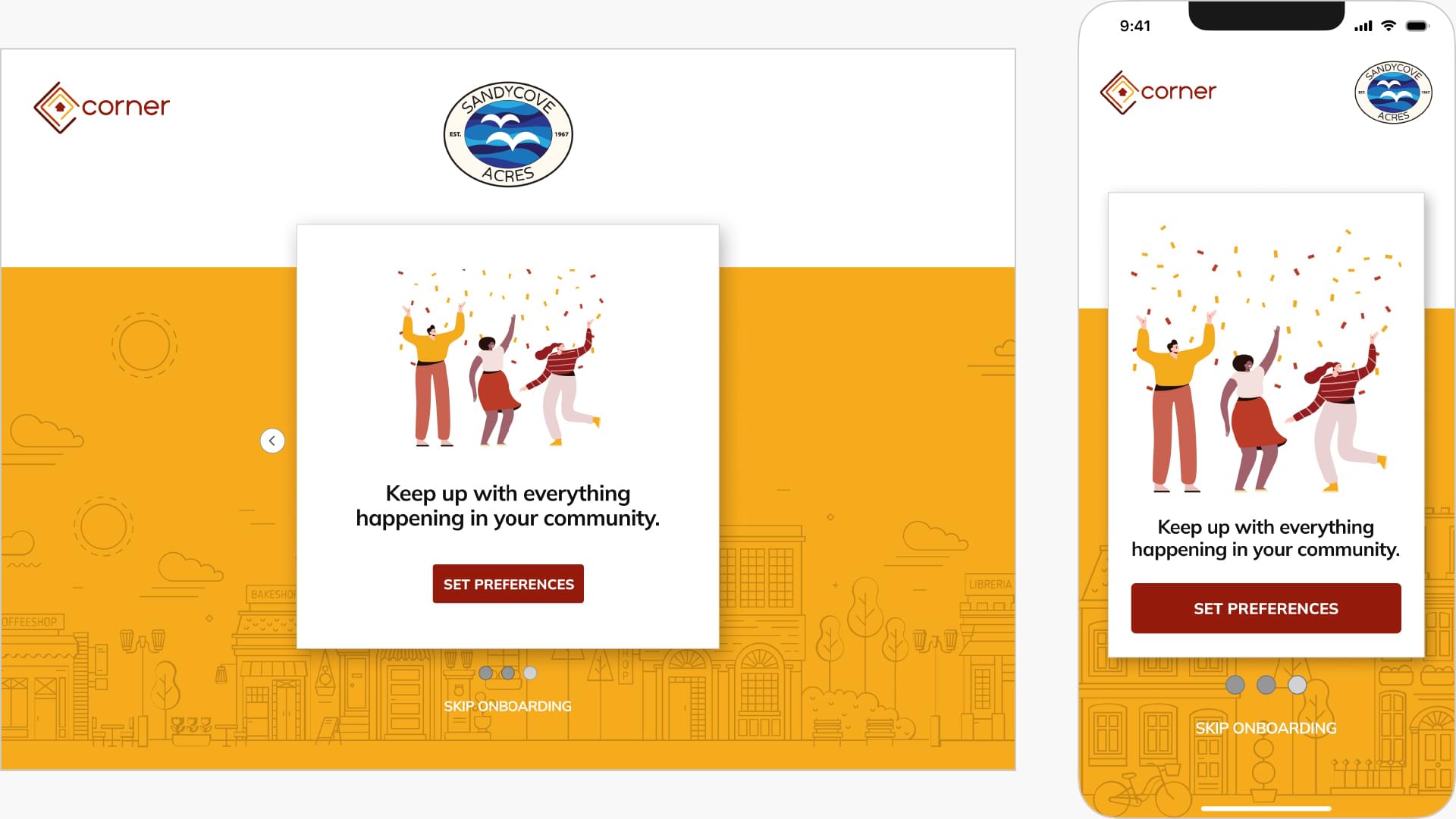
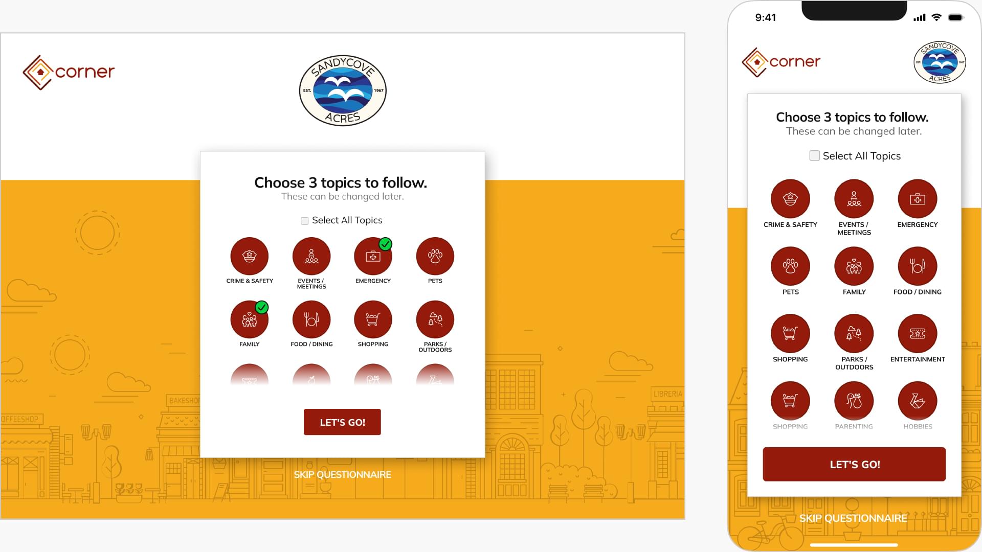
- Participate in an onboarding questionnaire to customize the dashboard with users interests.
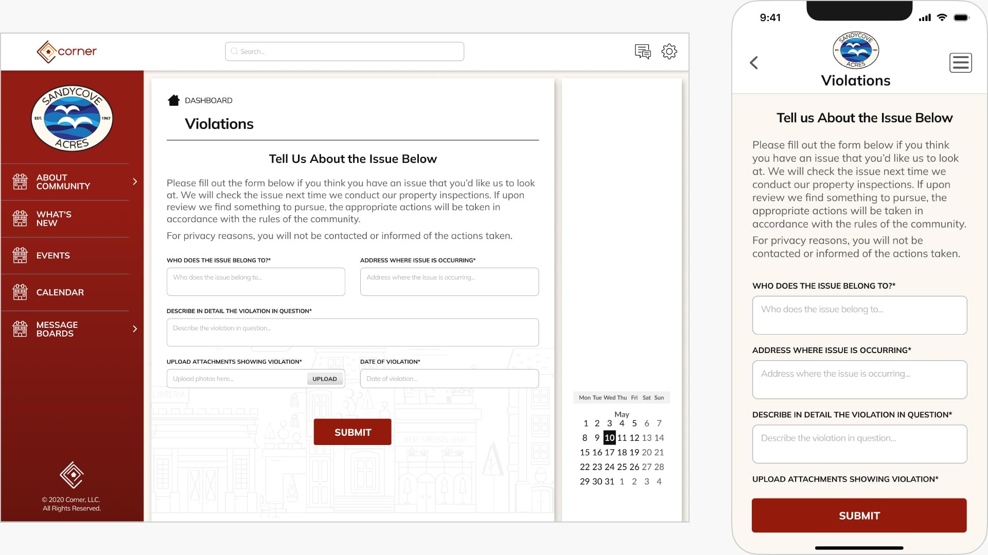
- Communicate violations to the community management easily.
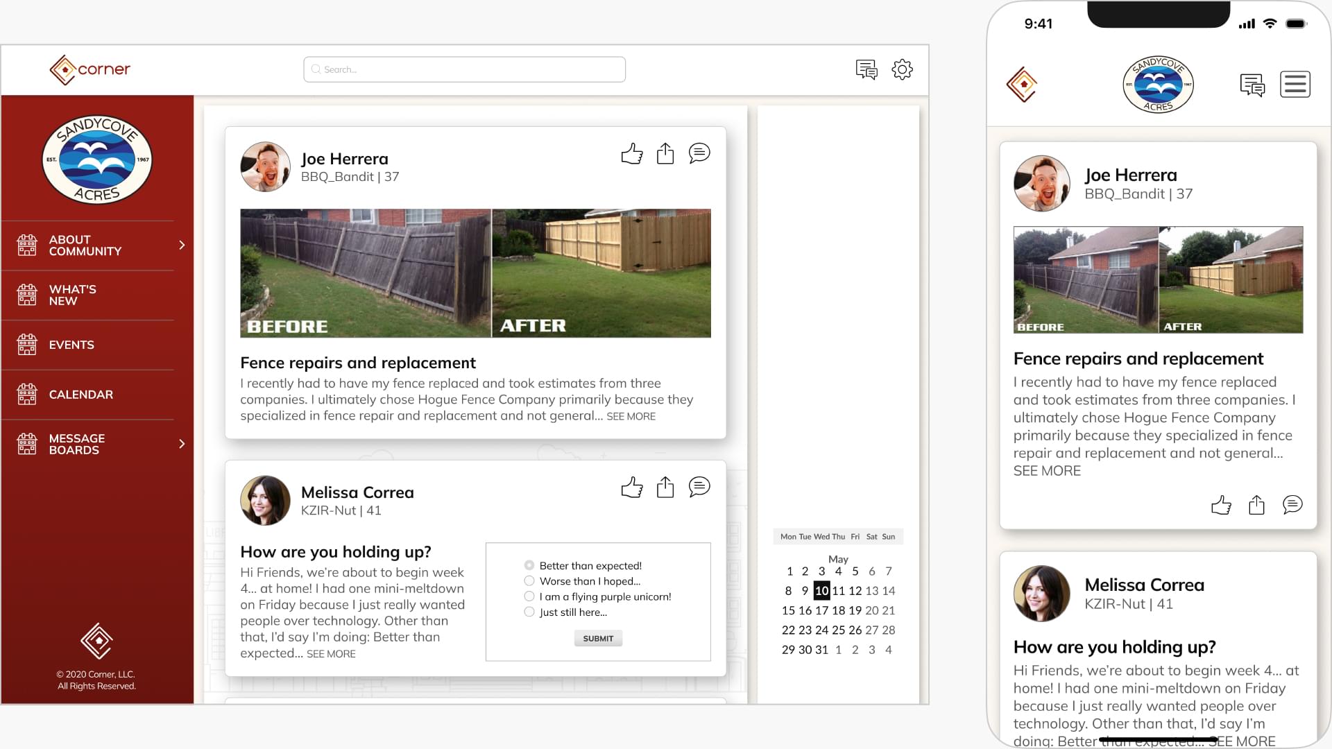
- Access a residents message board featuring general and community messages.
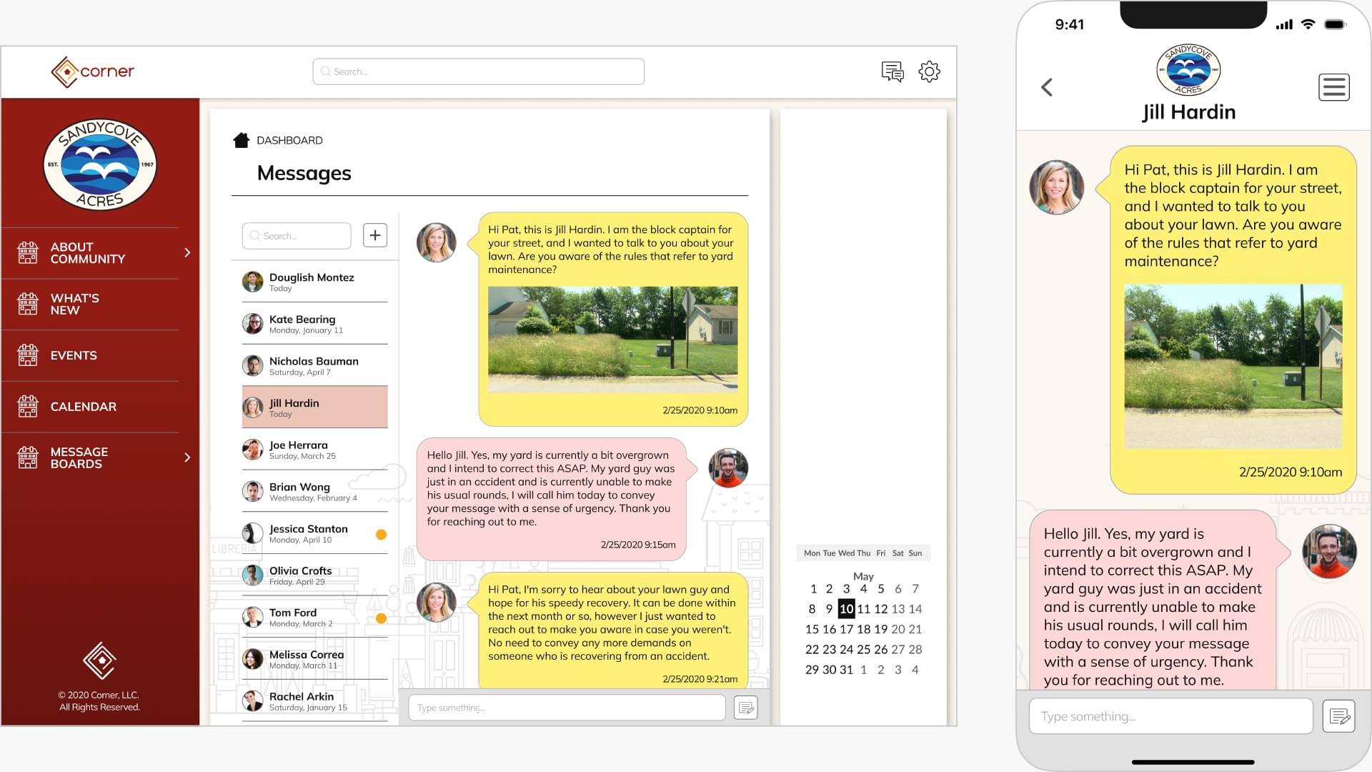
- General emails/IM section that community members have sent.
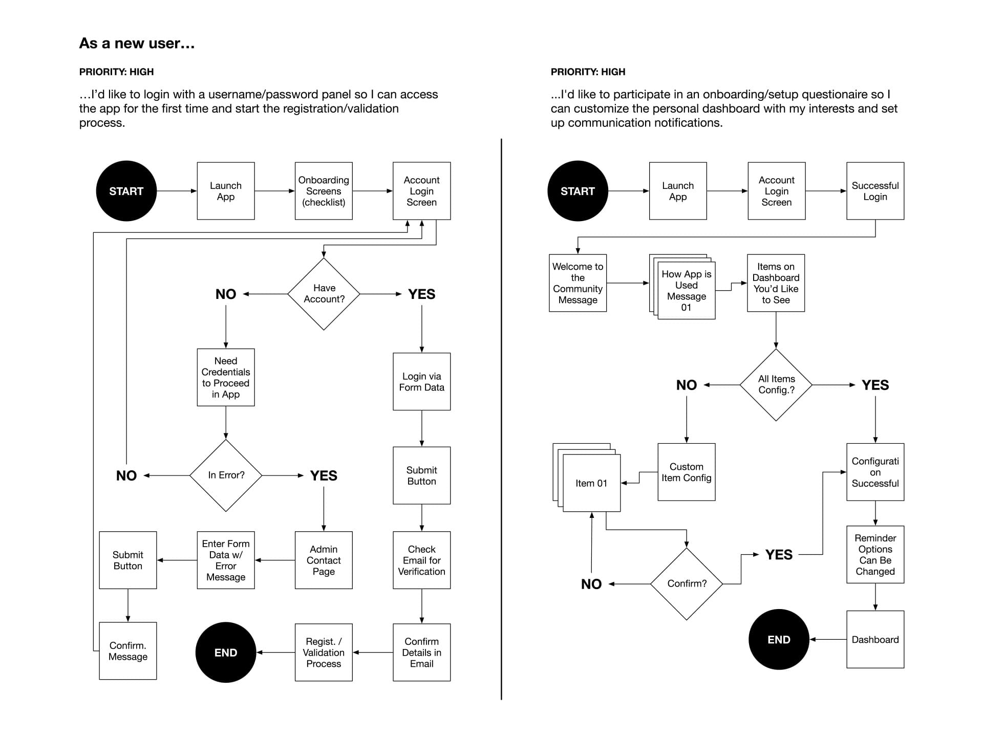
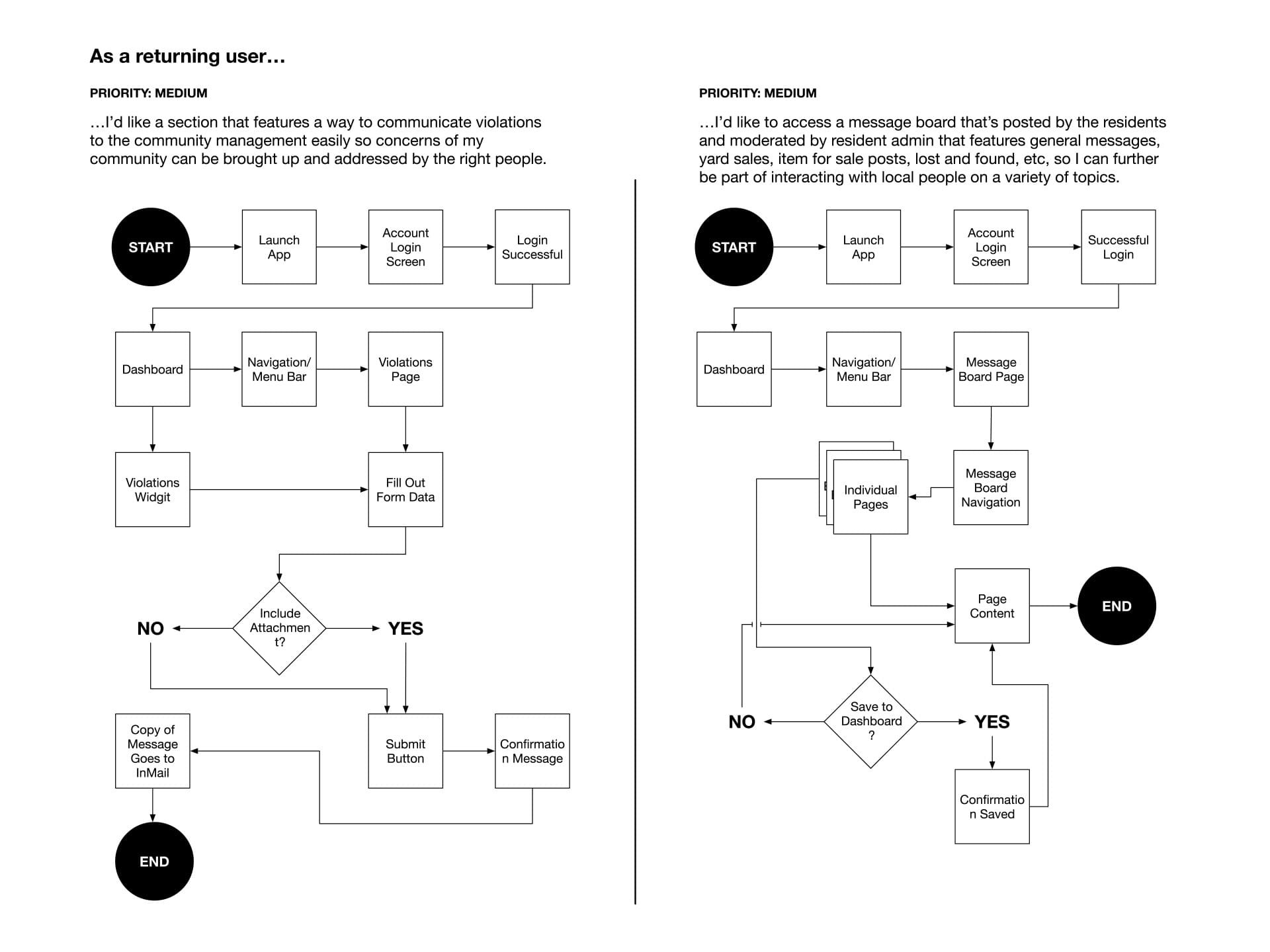
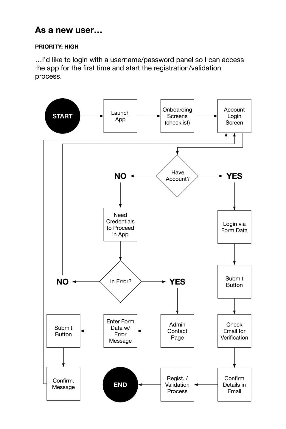
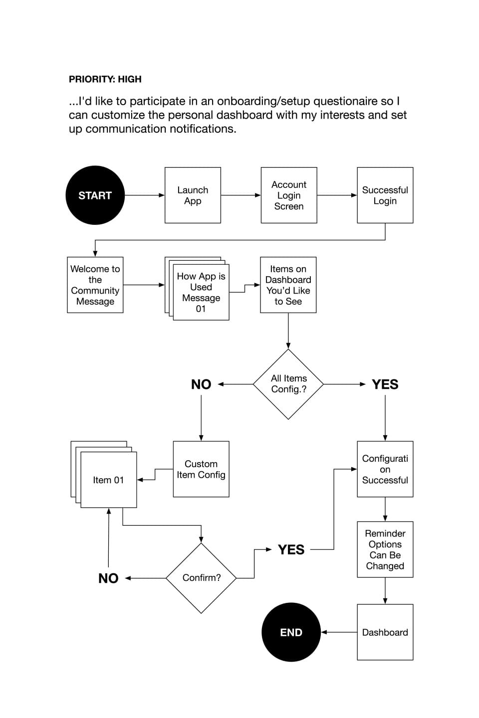
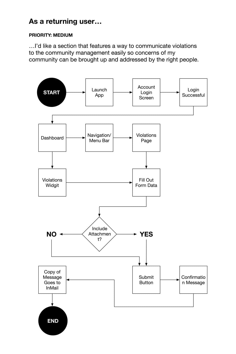
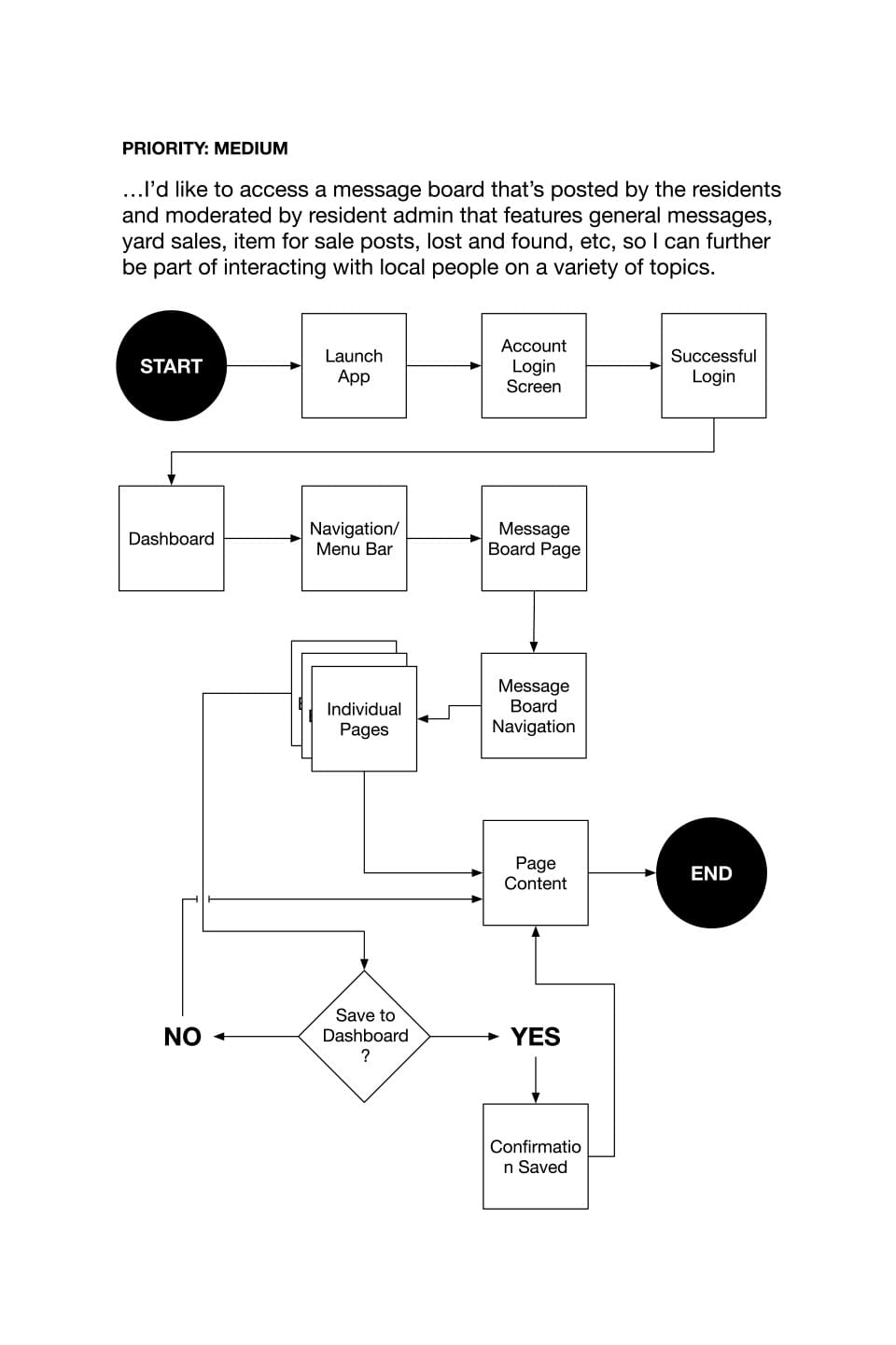
Getting my user flows down on paper gave me a starting point for how many steps users would need to reach the end of the task. It also allowed me to visualize how those steps would need to be connected.
Content Strategy
With the user flows finished, my thinking shifted to content and actions on a more granular level. Aside from the screens, I had to determine what actions I wanted on each screen and drawing up an outline really helped with consolidating what would go where. Doing some work on color schemes and imagery gave me a good idea on where I wanted to take the app design in later stages. Even though the app's design changed from the initial concept, this was an important step to take as I was able to reference what I did here to see what worked and what needed improvements.
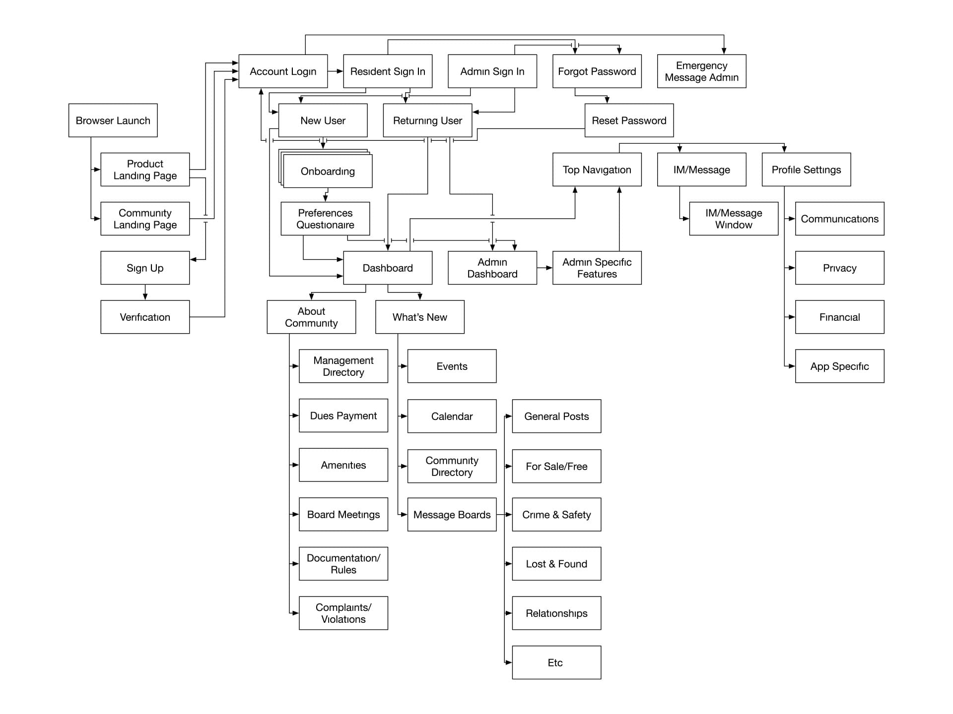
I also began to work out how the tasks would be logically organized within the app by creating a sitemap. This was helpful in laying out and sorting where I wanted information to be accessed from within the app.
Corner App Sitemap
Sketches & Wireframes
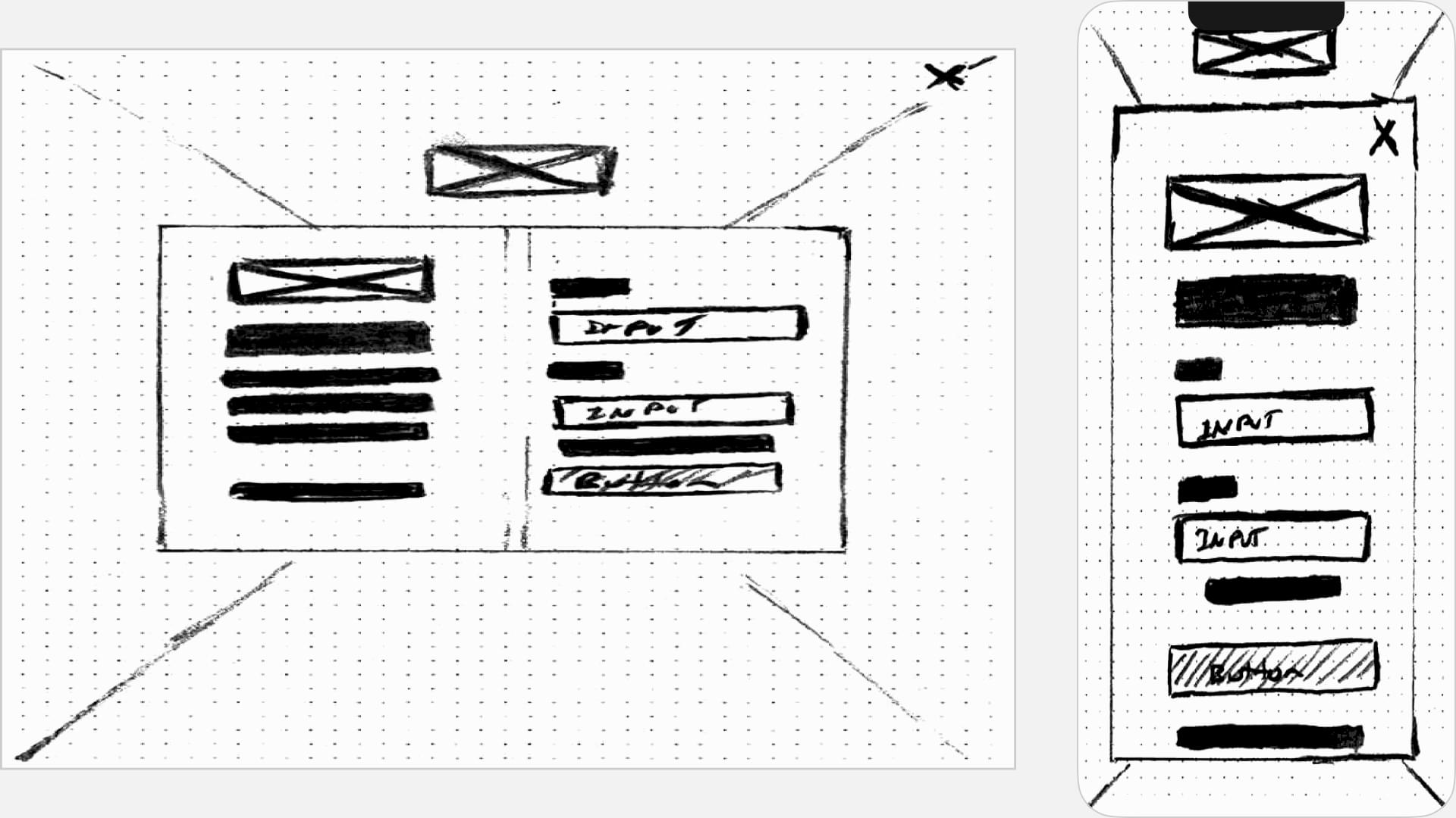
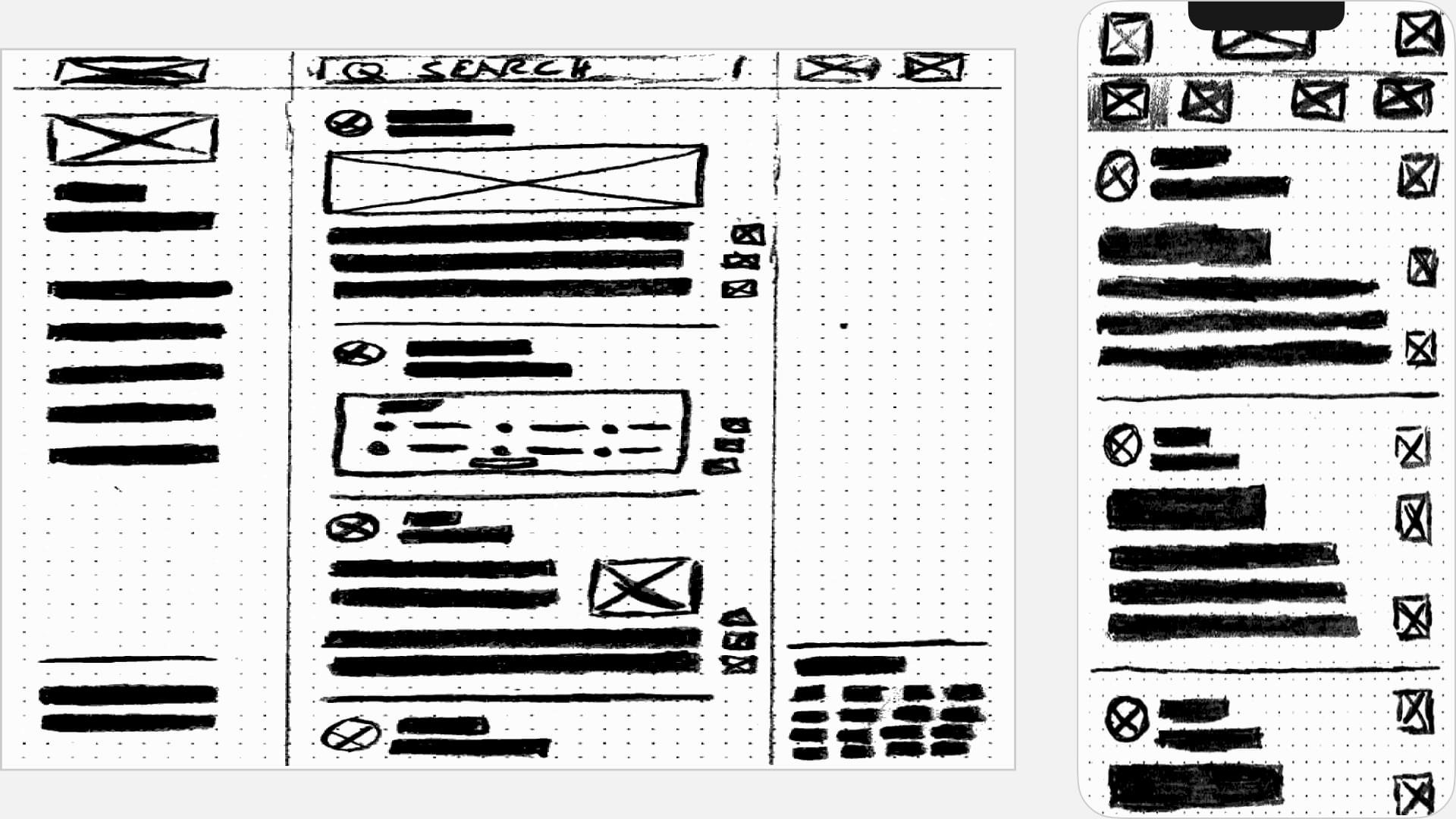
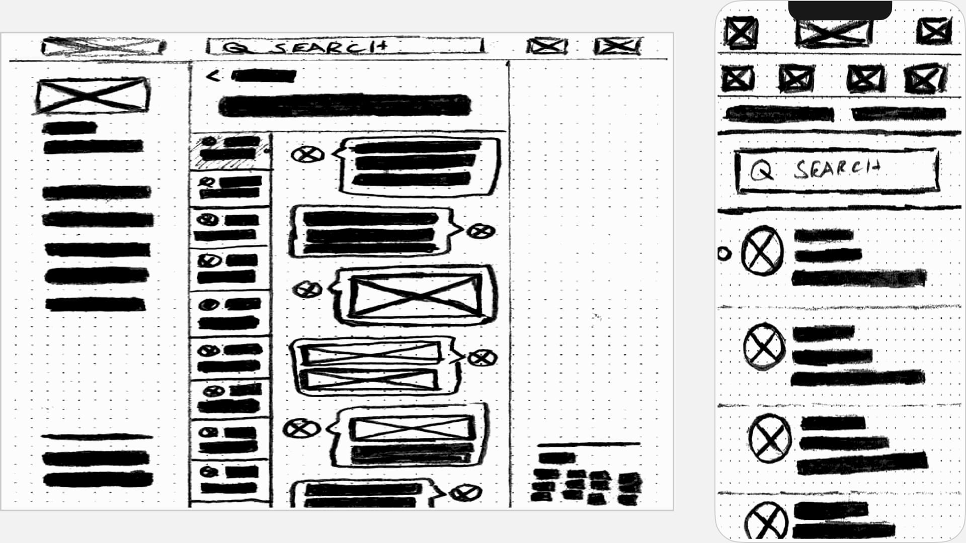
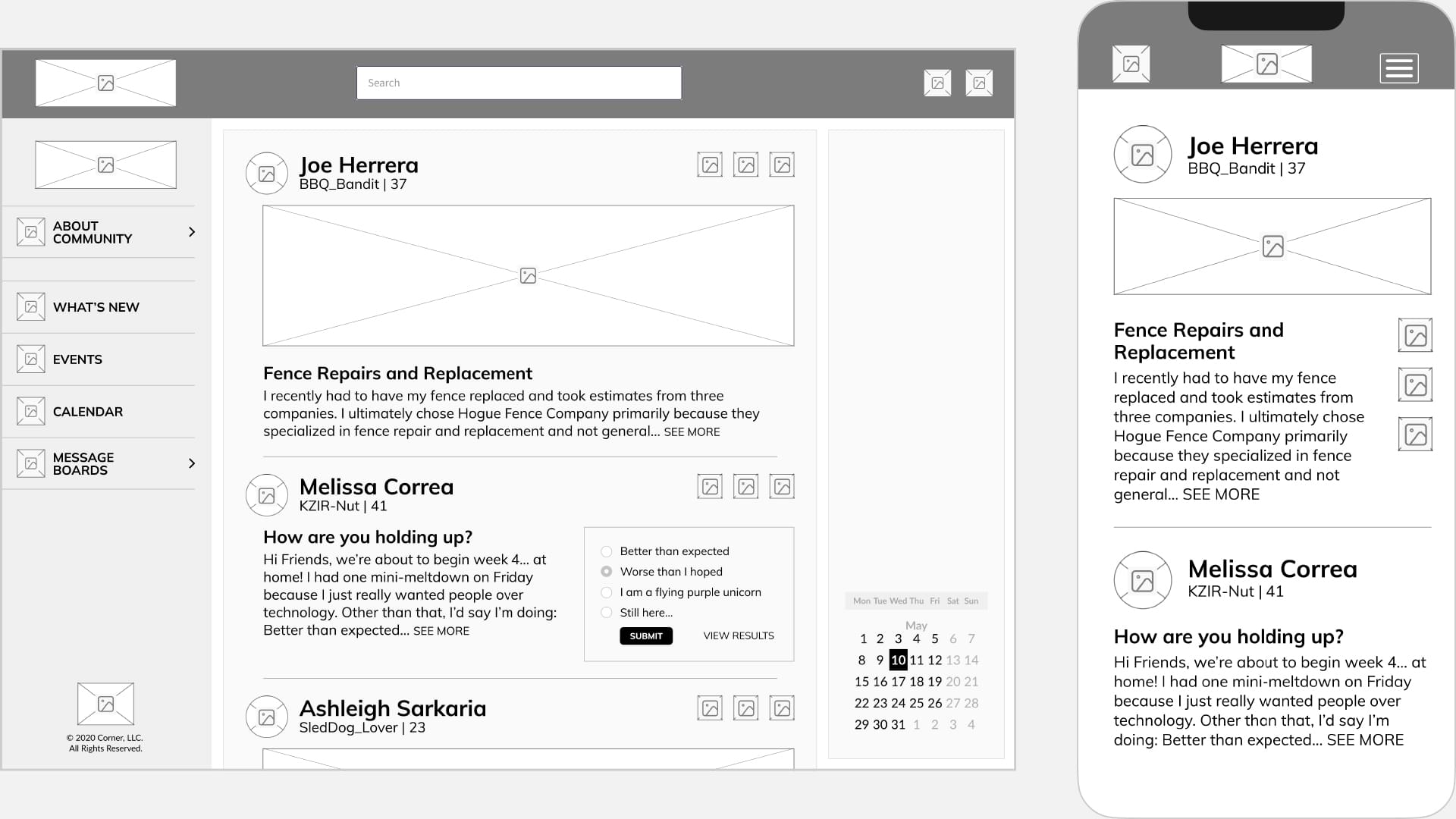
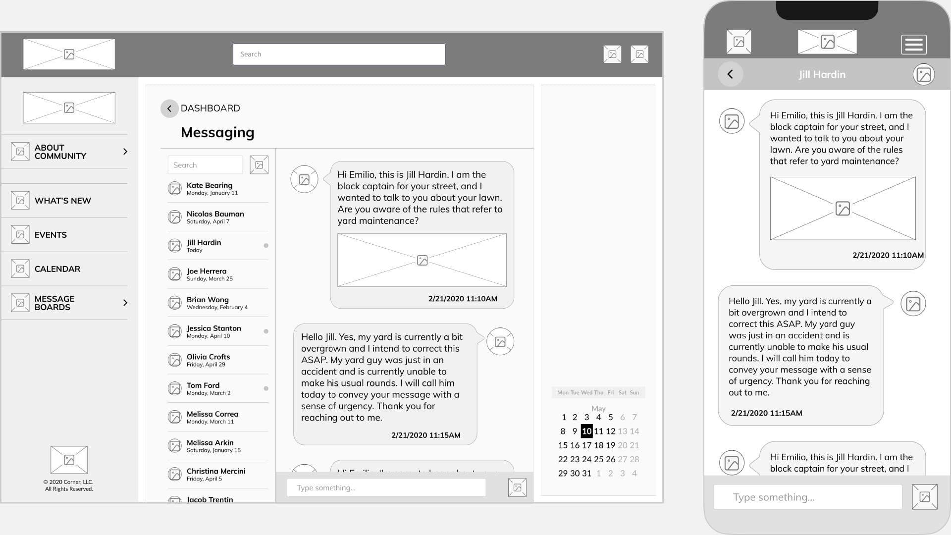
Using my sitemap, I started to work out how I wanted information to be shown on each screen. On paper I drew what I believed would be a rough representation of the screens that I would show in both desktop and mobile. At this stage, I wasn’t worried about content or detail and just put my thoughts to paper. Creating wireframes this way helped me work out different layout ideas from screen to screen and assisted in broader thinking of other screens that I hadn't accounted for in my sitemap, such as confirmation and error screens.
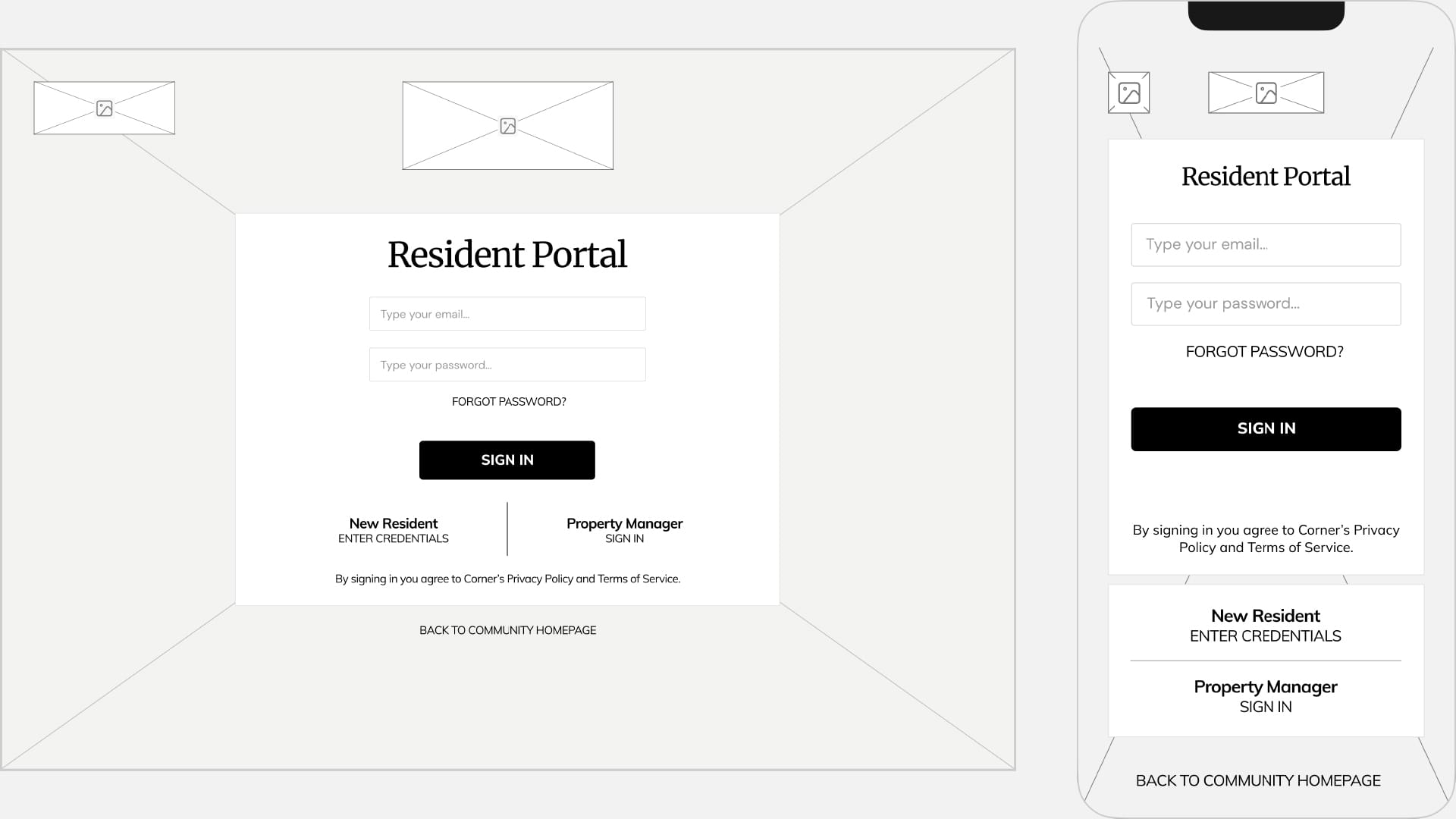
Once I was satisfied with the arrangement of elements on each app screen, I proceeded to create low fidelity wireframes in Figma and prepared the screens for my first usability test.
Brand Identity
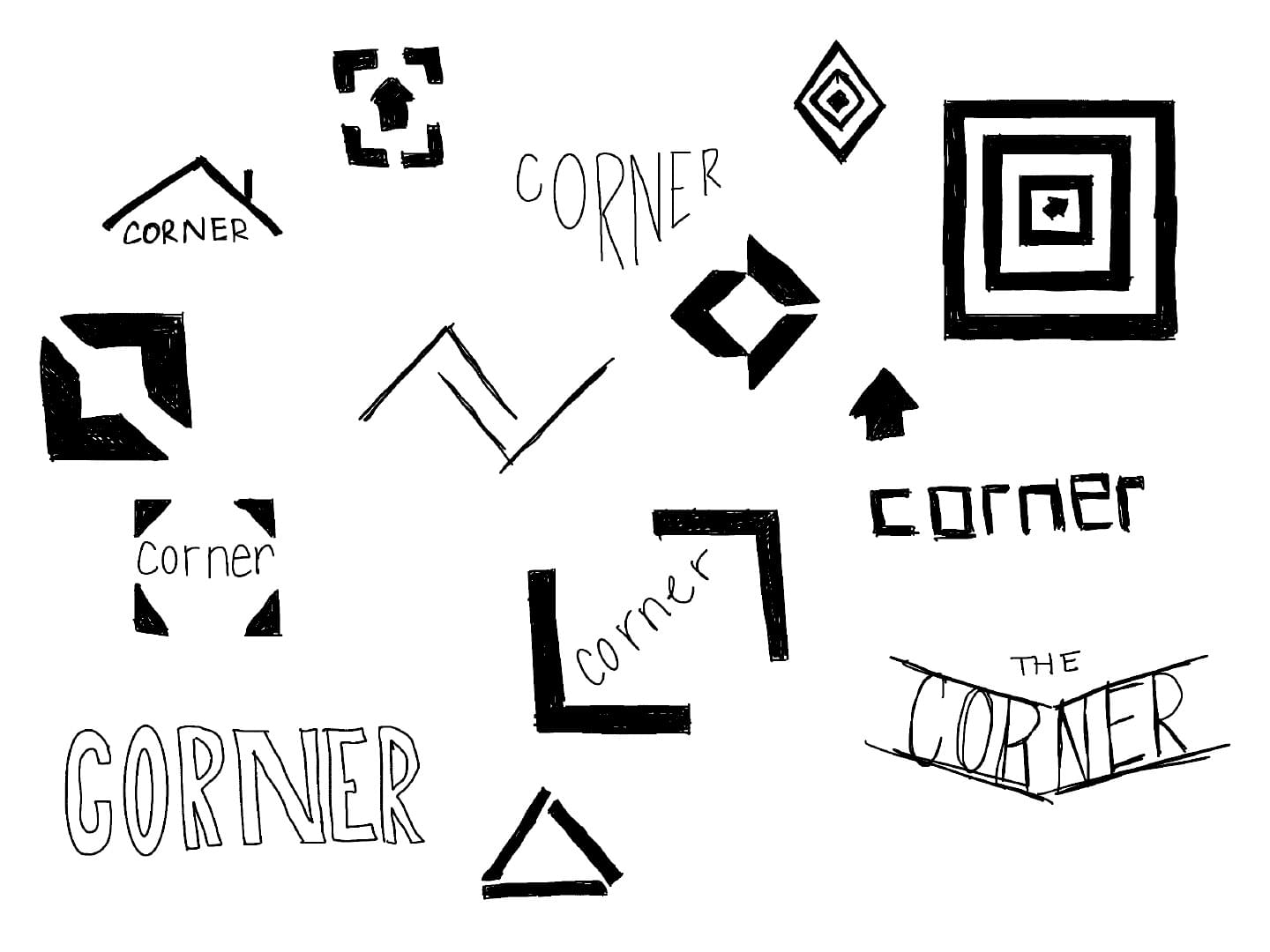
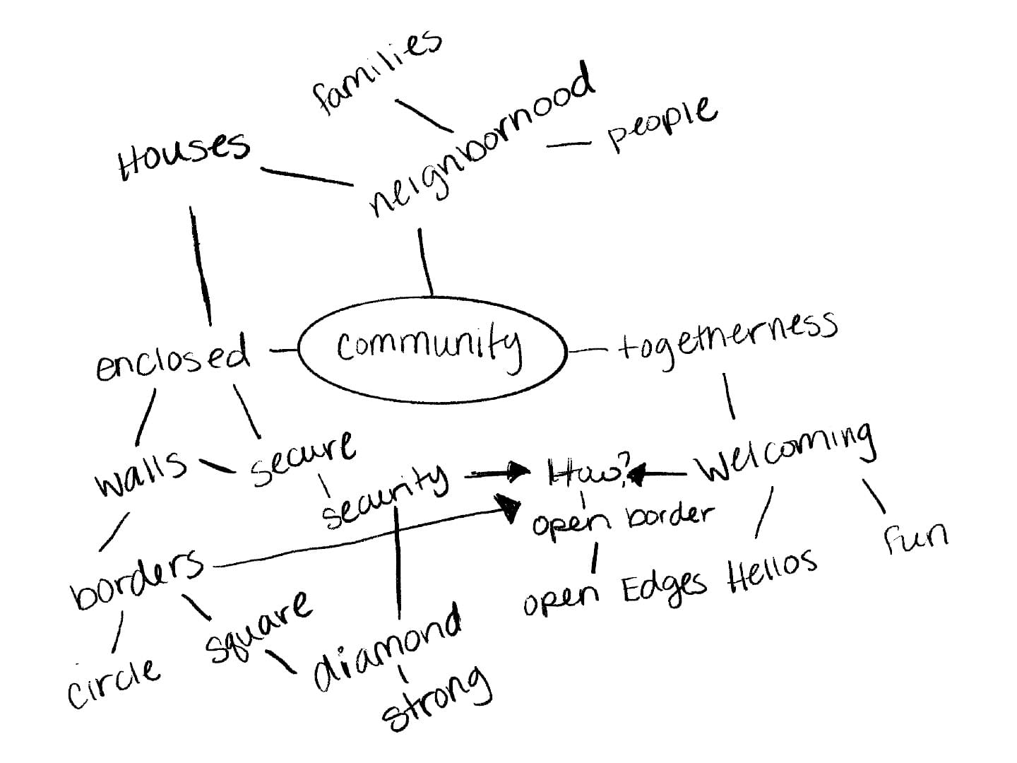
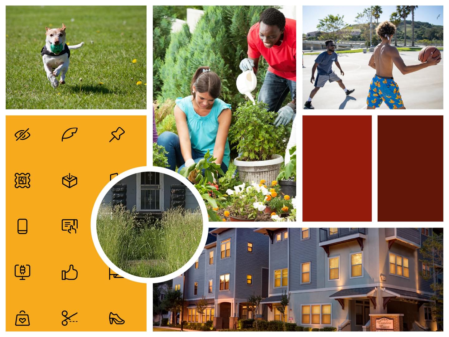
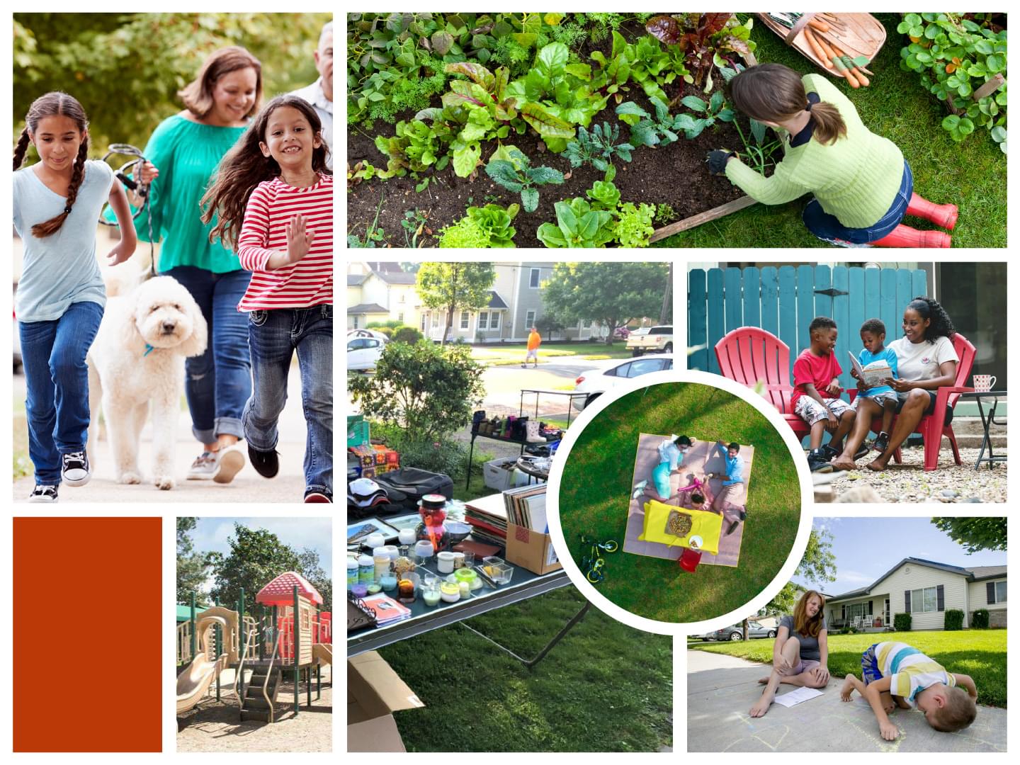
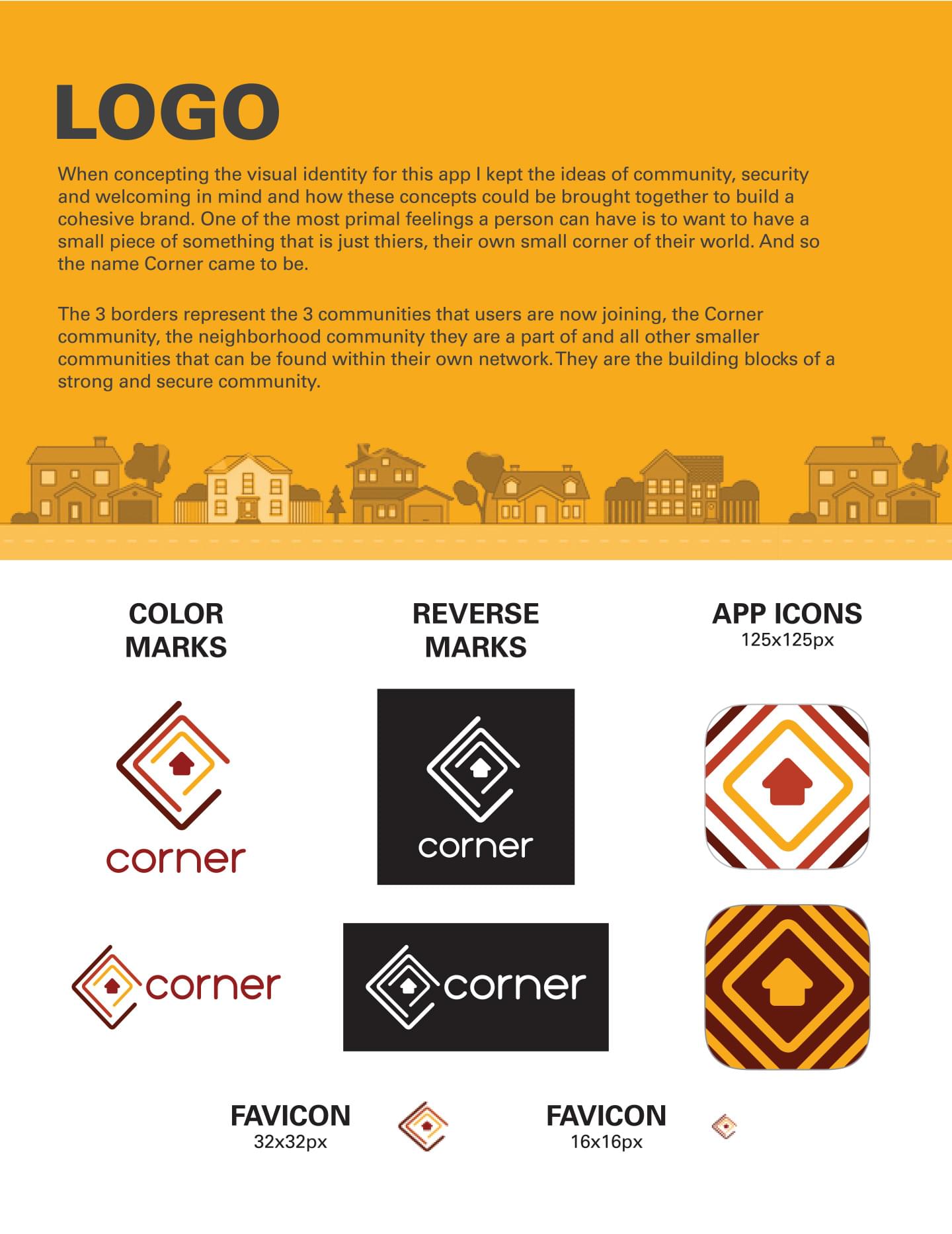
When concepting the visual identity for Corner I knew I wanted to embody the idea of community, security and welcoming. One of the most primal feelings a person can have is to want a small piece of something, just for themselves, and I wanted to bring these ideas together to build a cohesive brand.
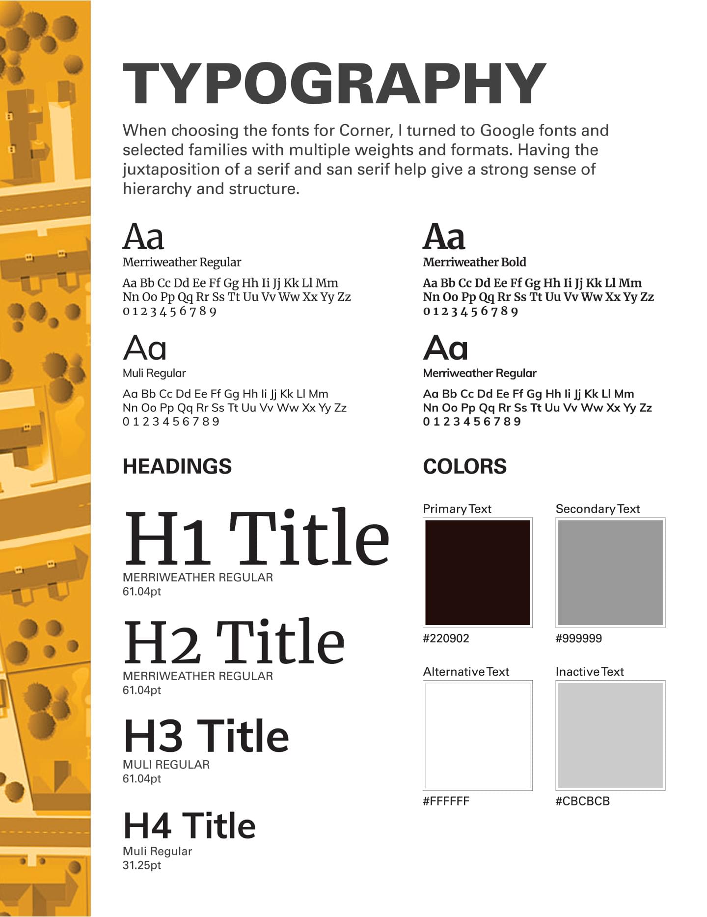
Designing the logo with 3 borders was a way of representing the 3 “communities” a user is joining. The Corner community, their neighborhood community and all other smaller communities within their network. Each one is a building block to a strong and secure community. The color palette is meant to give a feeling of warmth and belonging. More earth tones are a nod towards strong building materials like brick and stone and help convey a feeling of strength and security for the user. Finally, having the juxtaposition of a serif and sans serif font give a strong sense of hierarchy and structure throughout the typography.
Sketches / Mindmaps
Moodboards
Logo Finals


Style Guide
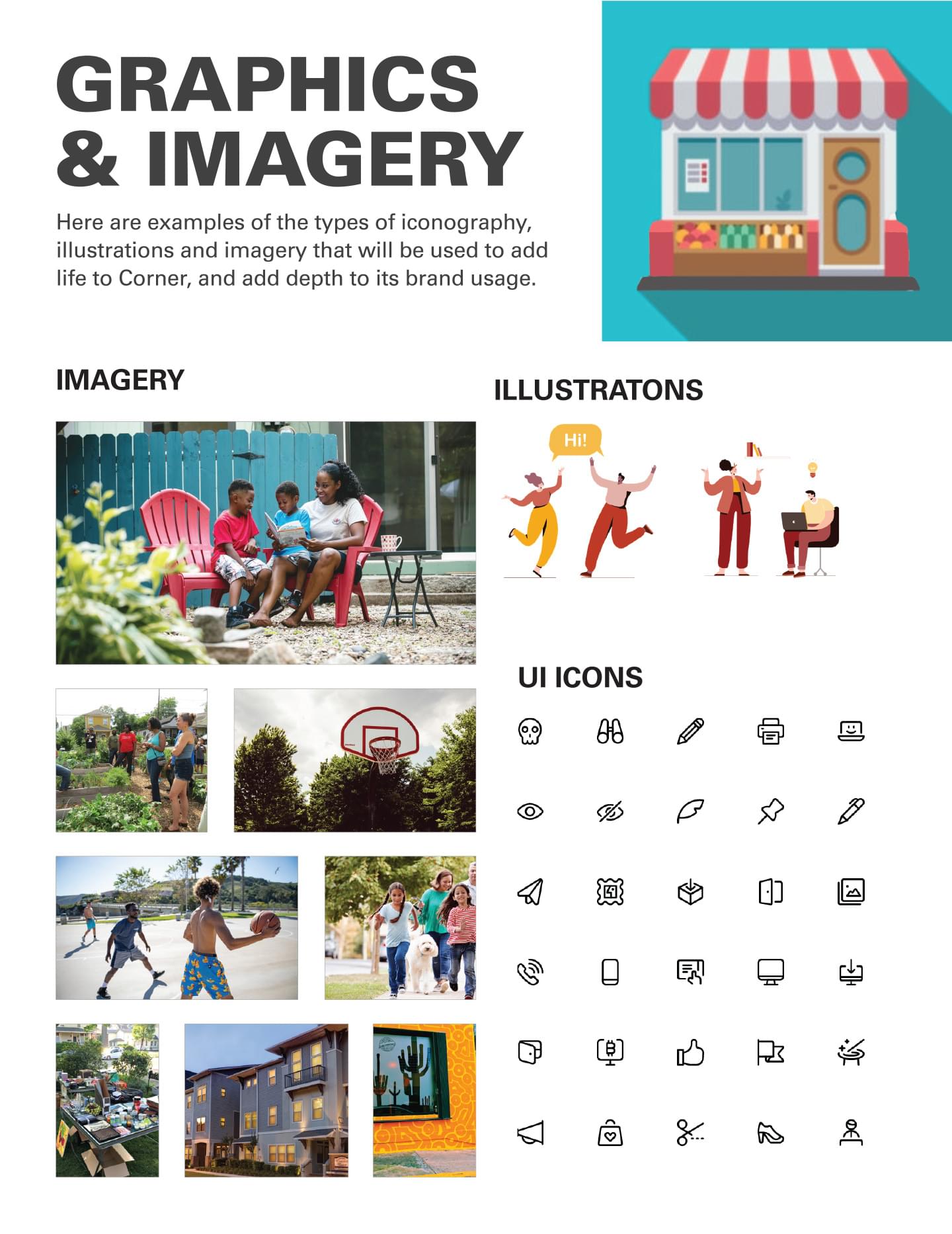
Reviewing the mind-maps and initial preference testing helped guide Corner’s brand development. It enabled me to narrow down the specific colors, typography and imagery that would boost the brand and give it life. The formal style guide that came from many explorations will aid future developers and marketers in utilizing the Corner brand.
High Fidelity Mockups
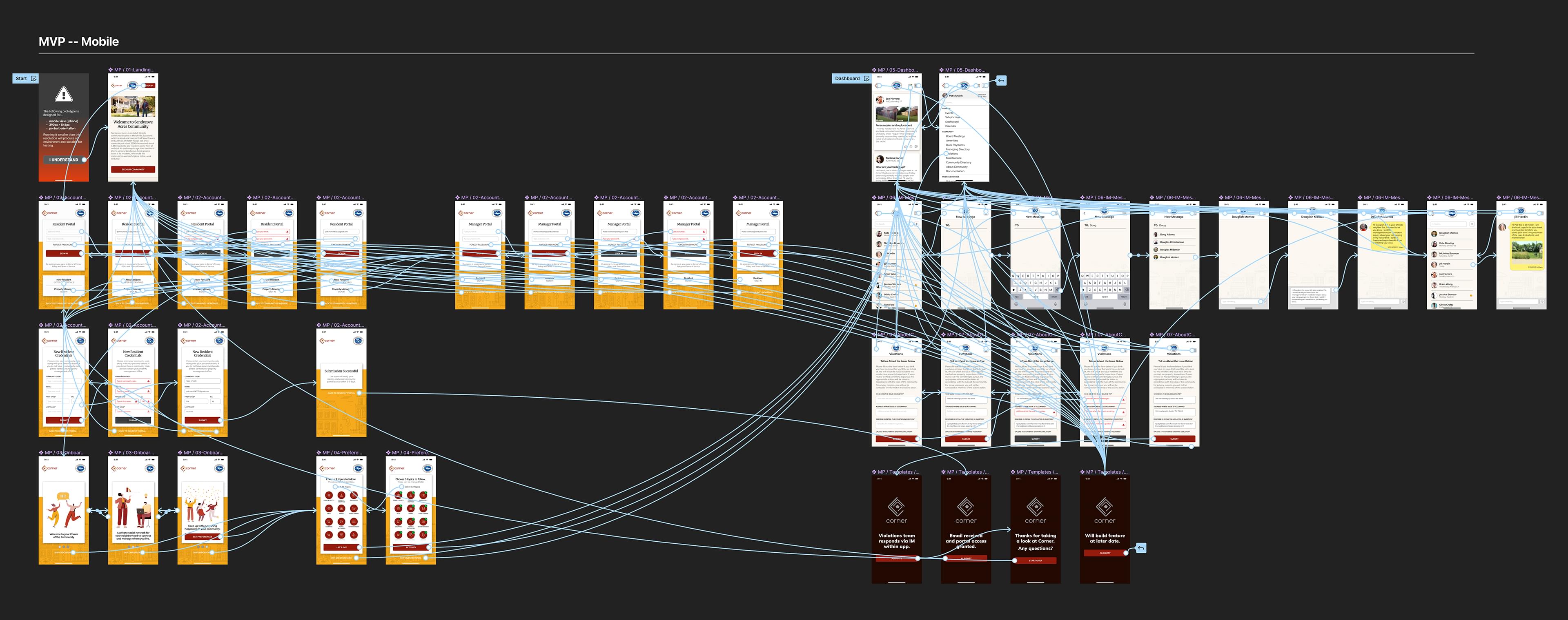
Referencing the ideas from the logo design, color swatches, photos, and iconography, I began to refine the low fidelity wireframes into these mockups. I continued using the same colors scheme and worked within the established iOS guidelines to work out the proportions for this MVP. Utilizing the component system of Figma made working with instances of each unique occurrence a breeze, and helped with the consistency of the finished product.


Prototype was designed for viewing on a Desktop computer only. Viewing on other devices might show unintended results.


Prototype was designed for viewing on a Desktop computer only. Viewing on other devices might show unintended results.
Usability Test
Testing the prototypes was performed with three subjects, one in-person and two done remotely. The challenge here was, since I was developing a web app in both desktop and mobile viewports, how would I go about testing both views. I decided to do one test for mobile and two tests for desktop.
Tasks
- You are a new user and want to sign up. How would you go about doing that?
- You want to send a neighborhood violation inquiry through the app. Where do you go?
- You want to IM one of your neighbors through the app. Where do you go to send your message?
Like previous testing sessions, instead of building the prototype based on a linear user flow, I built out as many screens as were relevant to all the tasks at hand. This way the user could interact with the prototype in a “real life” scenario and select areas they expect to have specific results from. Testing this helped with feedback overall.
Thankfully the testing sessions were successful with no technical issues, and the subjects gave helpful feedback overall. Some feedback encouraged me to look into revising some of the visual and interactive approaches which I will address in the refinement stage.
User Feedback...
- Current navigation was clunky and would like to see an icon used to access messages on mobile, rather than buried in the menu.
- Auto populate text fields need to be better designed.
- Users wanted to see an email confirmation screen indicating an email was sent to them that would queue them to sign in normally.
- Users expected some areas to be highlighted during the IM messenging process. It got difficult to follow after selecting the name of the person in the list.
Future To Do's...
- Look into the cause of performance lag in the prototype.
- Look at logos on the mobile screen and optimize for better readability.
- Add some sort of form validation on forms without the proper information.
- Look into tips to conduct a more polished Zoom interview using Figma.
- Try to stay more neutral in your feedback, and not potentially lead the user on which direction to go.
High Fidelity Prototype
Solutions Statement
The solution I came up with was a web app specific to communities and the people who live and work within them. I wanted to present a platform that would make users feel secure in the knowledge that their information was safe and that their community was there to support them. The idea was to standardize a platform that gave users, whether residents or management, the ability to connect with one another, access important documents, and share community information. A new user needs to have all the tools and information necessary to successfully become a part of their community.
Project Retrospective
What Worked?
I was happy choosing the ideas that led to Corner as a project especially as I’m a person that would utilize an app like Corner myself. I’ve lived in other HOAs before and, while are all unique, mostly they’re not all that functional. Simple tasks sometimes take too long, information isn’t relayed consistently, and communication always seems more difficult than it needs to be. Not only was I able to put together a nice looking app, but I believe the idea behind it was a solid one that many people could take advantage of, regardless if they lived in an HOA or not.
What Didn't?
One thing I noticed in the workflow I created was that I kept having to add new features or new screens to convey the message I was going for. I spent time working through the sketches and translating those to wireframes, then to mockups, and now a prototype. During the entire process I kept finding more features to add or change. If I were working on a team this would be disregarded as scope creep and it would be easy to refocus on the task, but working alone means there’s no one to tell you not to explore that route. If you did, it cost time which, towards the end of the program, I did not have much of.
What Surprised You?
I was surprised by the research portion of this project. Originally I started with an idea that affected only a small portion of the population, and focused my survey on that idea. After analyzing the results of the survey, I felt that it could go further, and apply to more people, simply by refocusing on the problem I was trying to solve. As it stands now, Corner has more meaning, and can be more widely used, than my original idea.
Bottom Line Takeaway
Starting with an idea, and asking yourself ‘How does this solve the problem’ is a good practice to have. Thinking out loud, taking notes, making mind maps are also good techniques that help uncover whether an idea is viable or wishful thinking. I will continue utilizing these approaches in future projects.
