BusyBus is a conceptual iOS mobile app developed to solve a fictional transit issue caused by urban users with information about incoming buses and timeframes so they never miss their ride.
Case Study for Busybus

- UX Strategist
- UX Researcher
- Visual Designer
- 2.5 Weeks
- Mike Marin (solo)
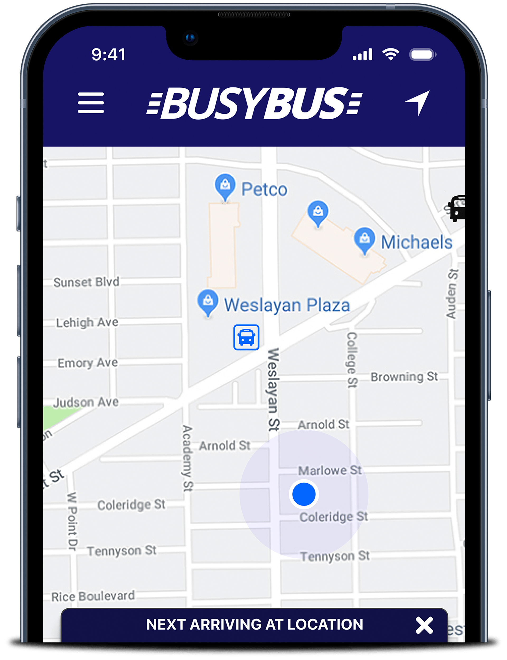
Case Study for Busybus

BusyBus is a conceptual iOS mobile app developed to solve a fictional transit issue caused by urban users with information about incoming buses and timeframes so they never miss their ride.
- UX Strategist
- UX Researcher
- Visual Designer
- 2.5 Weeks
- Mike Marin (solo)
Project Scope
BusyBus was a project that was designed to familiarize UX designers with a streamline approach to solving a fictional problem. Instead of going through each step, requirements of time and deliverables were set up front to stress a solution quickly. While not as intense as previous case studies, the BusyBus project gave me an idea of approaching a design problem, thinking out the core steps and delivering what was needed to more forward in the course.
Goals
- Feature clear data on bus lines servicing specific stops.
- Show arrival and departure times for each bus as they commute to each stop.
- Showing riders an estimated time for them to reach a bus stop to make their bus.
Challenges
- Showing a solution in the minimum amount of screens possible.
- Understand the process of user testing, and how to conduct an effective study with a minimal amount of screens.
- Present the process, solution and demo in prototype form in a short specified amount of time.
I used the Design Thinking process to work through this project.
Problem Statement
A fictional city near you is expanding beyond what the bus transit lines originally were designed to serve. Now because of this expansion, bus riders are finding that bus routes are overlapping. They have expressed frustration when the bus they are running to catch ends up not being the bus that they are expecting. Riders want to know what bus is coming next, when, and how much time they have to reach the bus stop to make the bus.
The biggest pain point with commuters is the bus stop at Washington and State, which has 7 bus lines serving this stop. The solution should be created for an audience that is on the go, and as the current budget allows, should be limited to three functional screens.
User Survey
In order to better understand the problem, and to learn how potentials users feel about the idea of using city bus transportation, I performed an online survey of 21 people. I needed to understand how these potential users would prefer to receive their scheduling information and see if they would even be interested in a mobile solution.


25-35


I structured questions to learn:
- If they were current or former users of public transit.
- What benefits or concerns they had about public transit?
- What options they used to look up transit schedules.
- Frequency of usage for public transit?
- How do you arrive at the transit pickup location?
Some key data points were:
- 76.2% of those surveyed currently use public transit.
- 85.7% Relied on their cities public transit app to relay scheduling.
- 57.1% Used this method of transit once a week.
- 71.4% Walked to their nearest transit stop.
- 57.3% Always get on the right bus for route.
While the purpose of this survey was to gauge general information from a potential user base, it also was meant to propose feature ideas for the future mobile app solution. All users surveyed were proficient with technology and used it regularly which made it easy to propose both realistic and pie in the sky solutions to solve this problem.
Competitive Analysis
I needed a baseline to start developing a workable transit app so I started looking at other competitors that worked somewhat closely to what I was looking to build. I gathered information, focusing primarily on the timetable presentations, ease of use, and the types of transportation available to view.
Research into these competitors yielded information about company backgrounds, sizes and revenue. It also highlighted opportunities for competitor growth.
If this project had been started with an open direction much of this information would have been useful to develop on. However, the BusyBus project was specific in scope and therefore most of this research was done as part of the exercise but, in the end, not utilized.


Prototype was designed for viewing on a Desktop computer only. Viewing on other devices might show unintended results.
Sketches
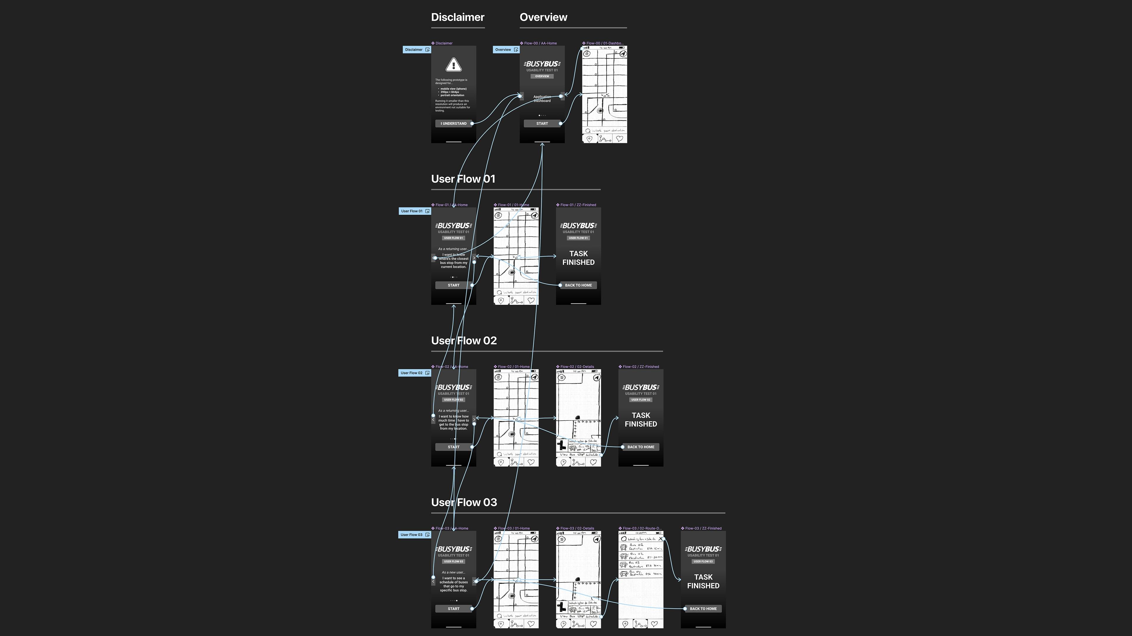
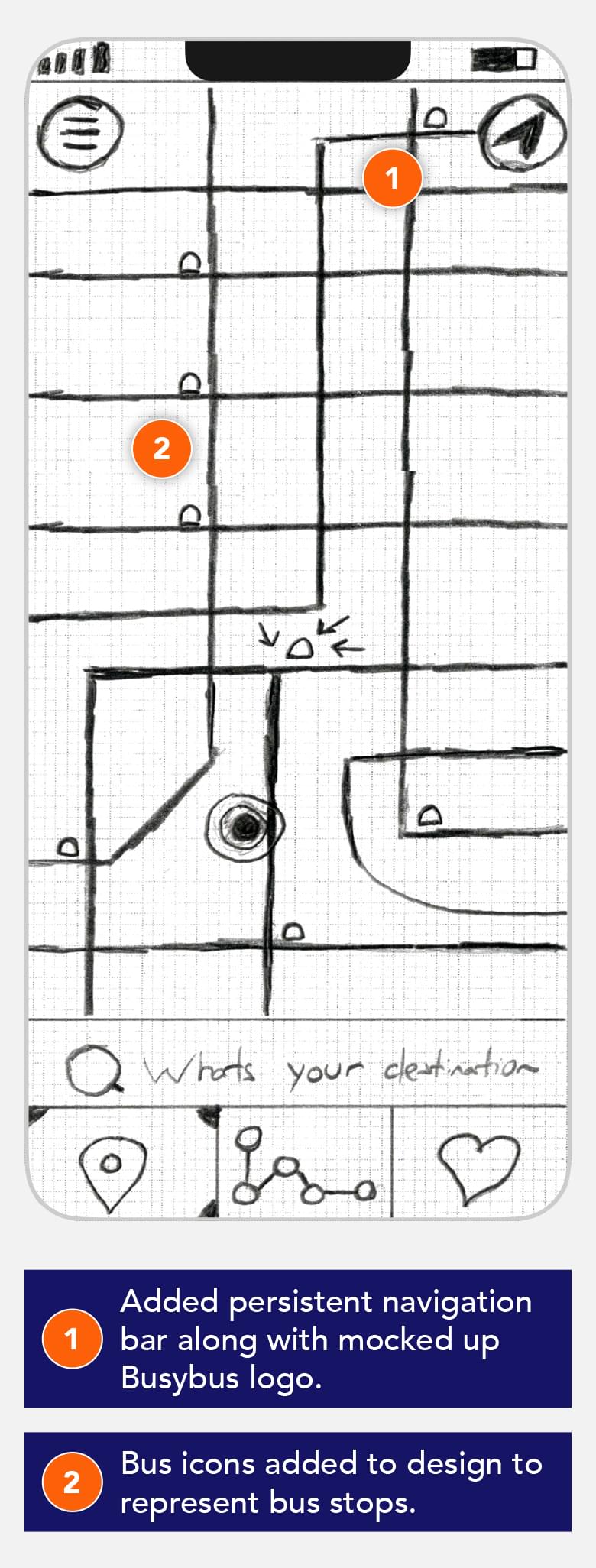
Because I chose to focus only on the top level tasks the user wanted to see, the first round of sketches were developed into a quick paper based prototype that was used to do a second round of User Testing. The paper prototypes reflected the three User Stories that were most important, and gave feedback on important visual features that the users wanted to have available to them while using an app of this type.
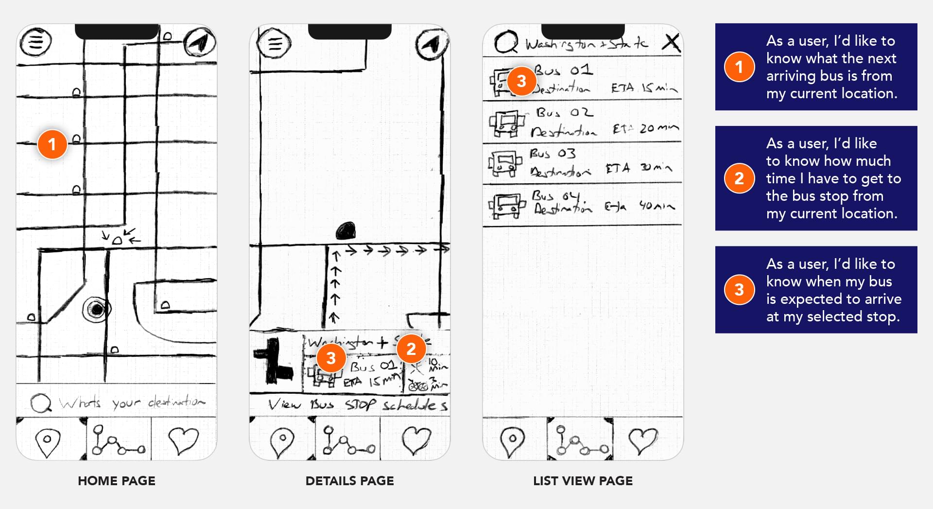
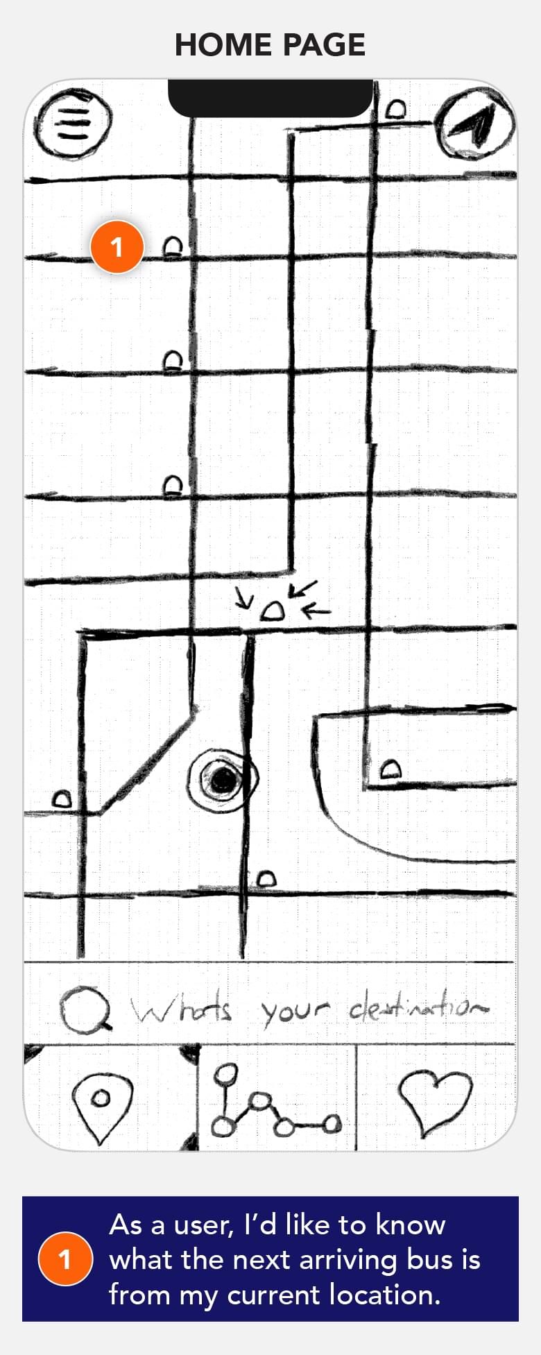
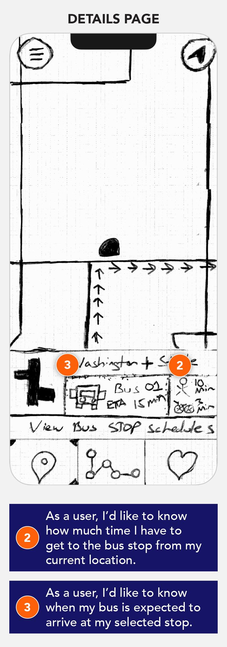
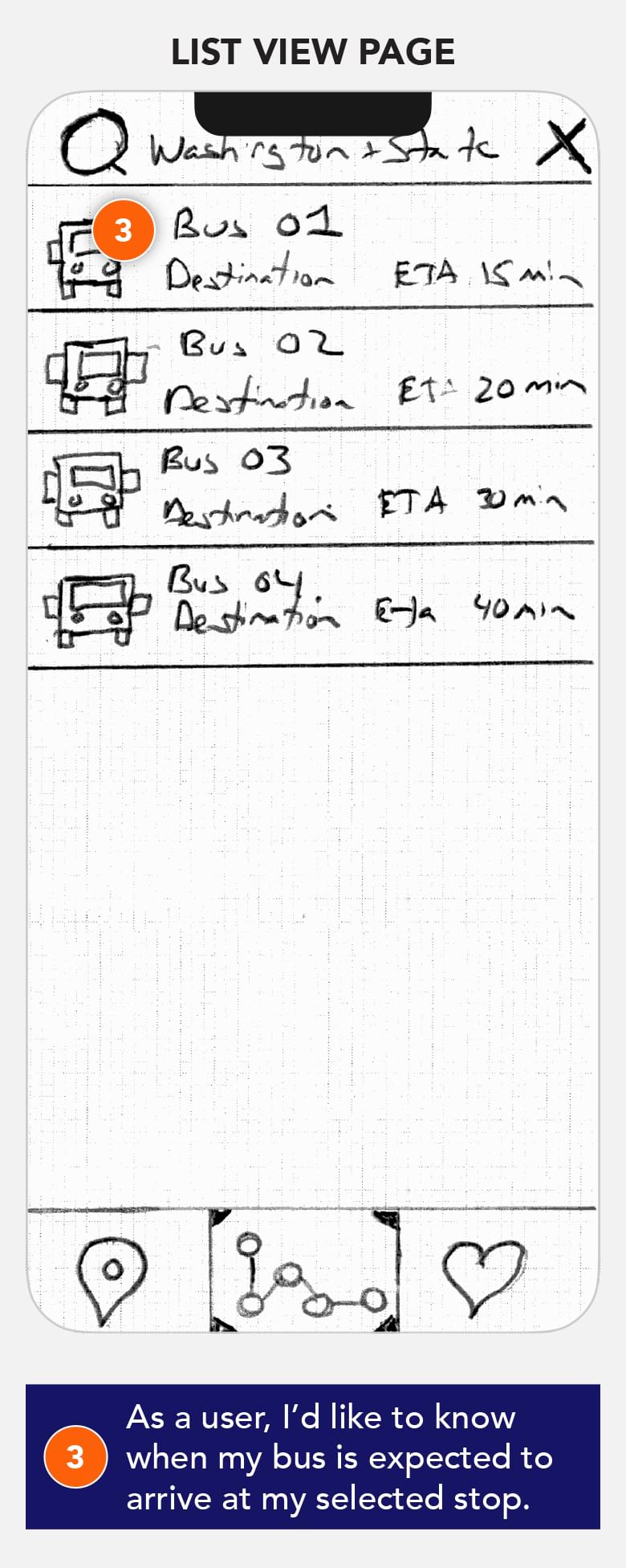
Low Fidelity Prototype
Branding & Style Guide
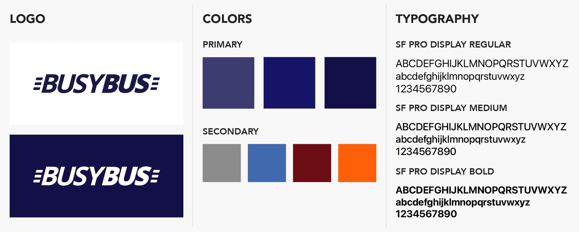
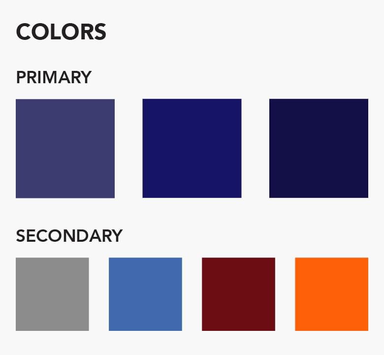
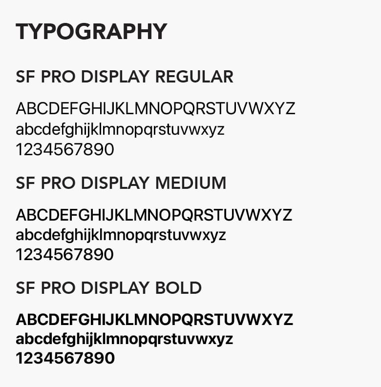
Creating a logo and style guide was not initially in the scope of the project. However, as I went on I realized that having a basic color scheme, logo and icon set would help the app feel more developed and put together.
I chose to keep the design clean and monochromatic with bold accent colors chosen specifically to highlight important information within the app.
High Fidelity Mockups
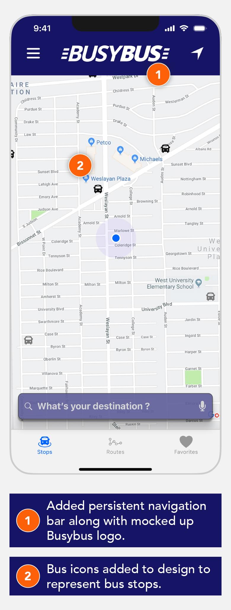
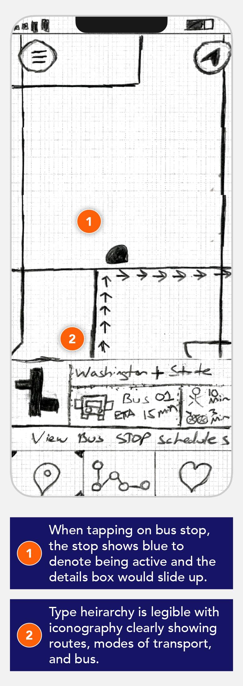
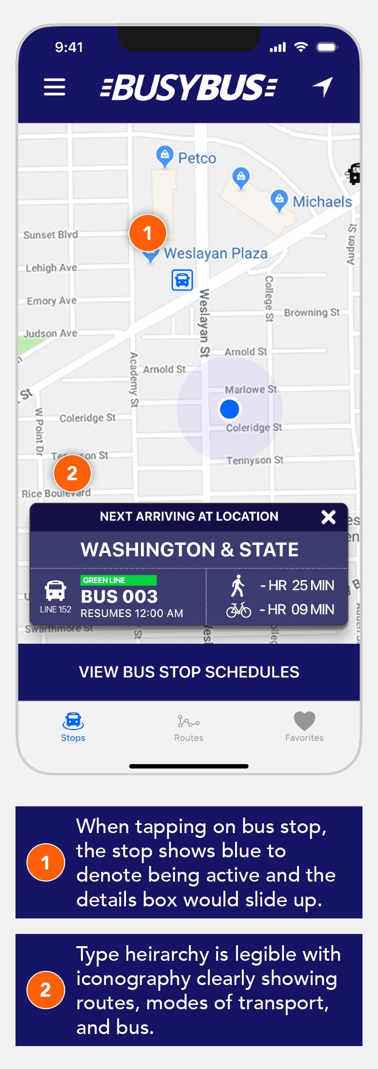
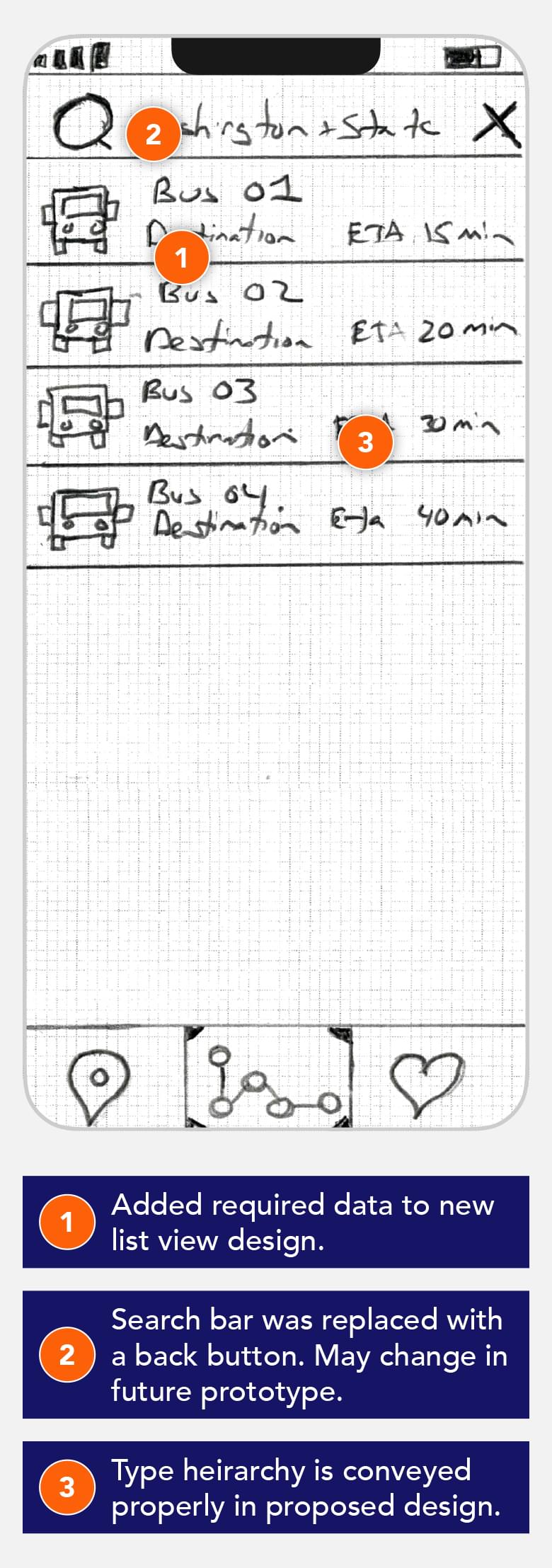
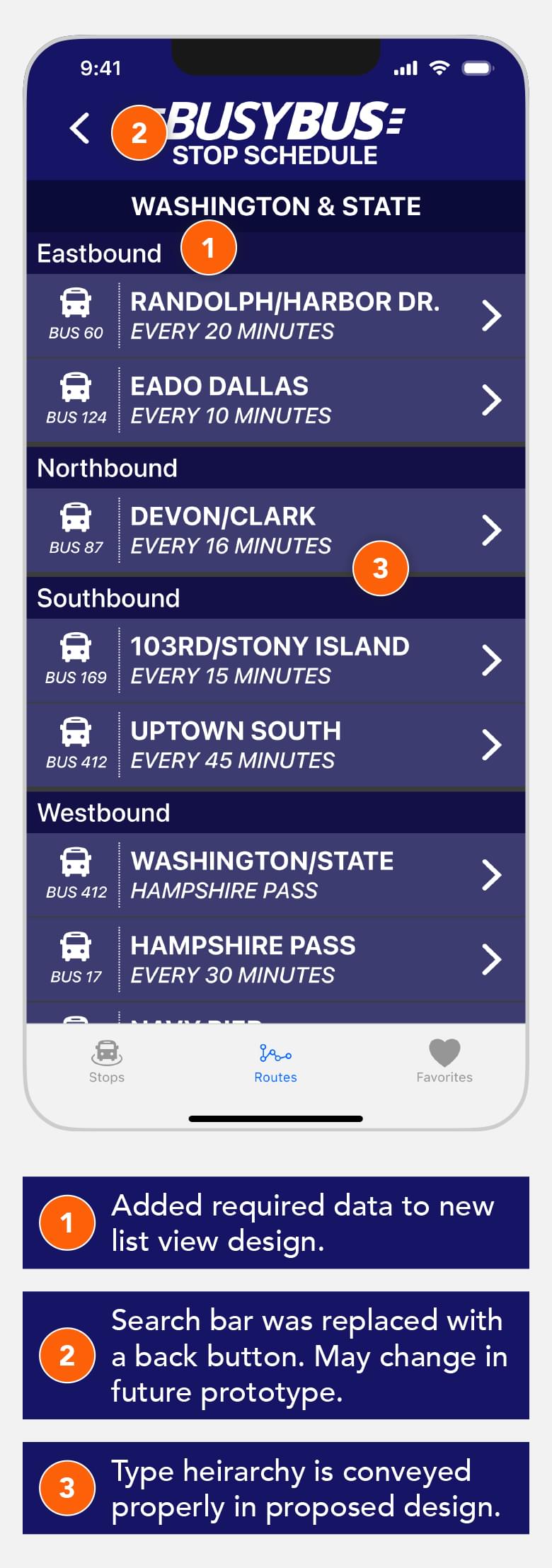
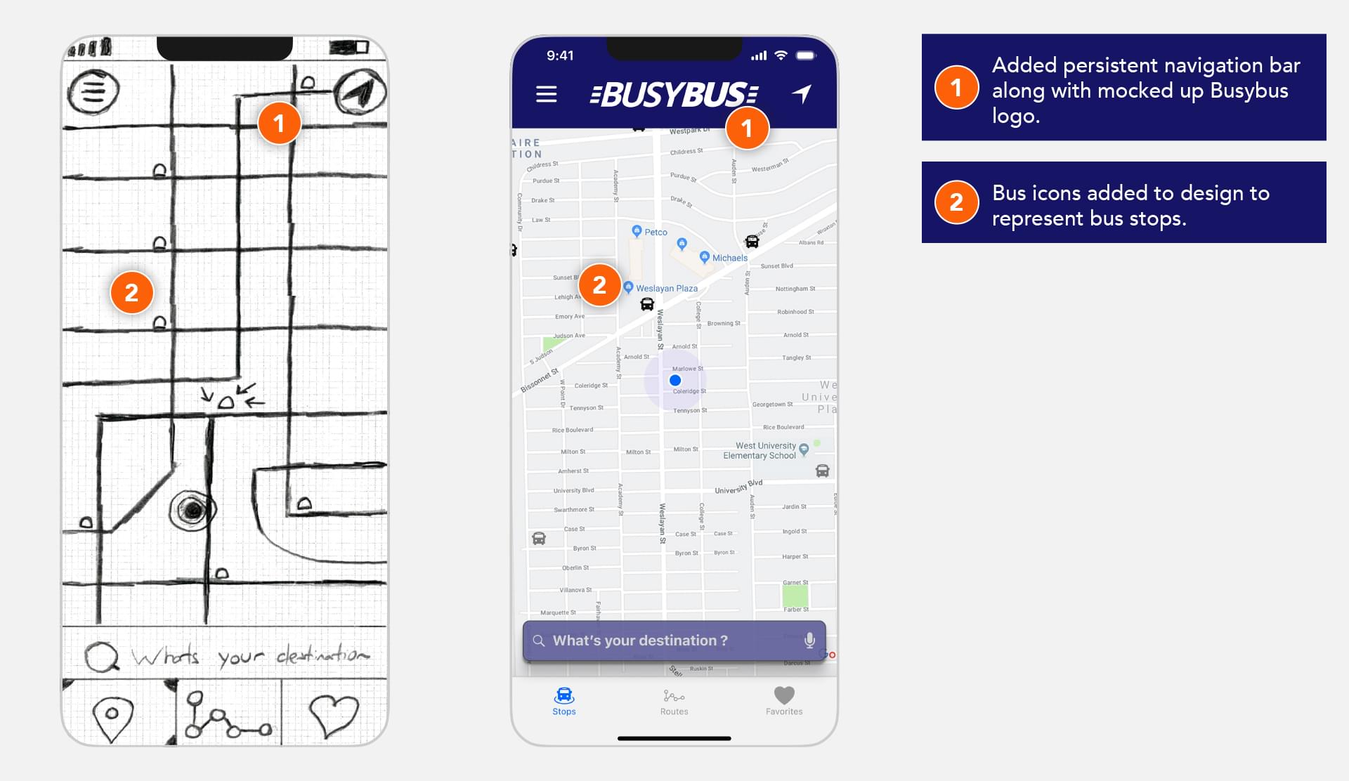
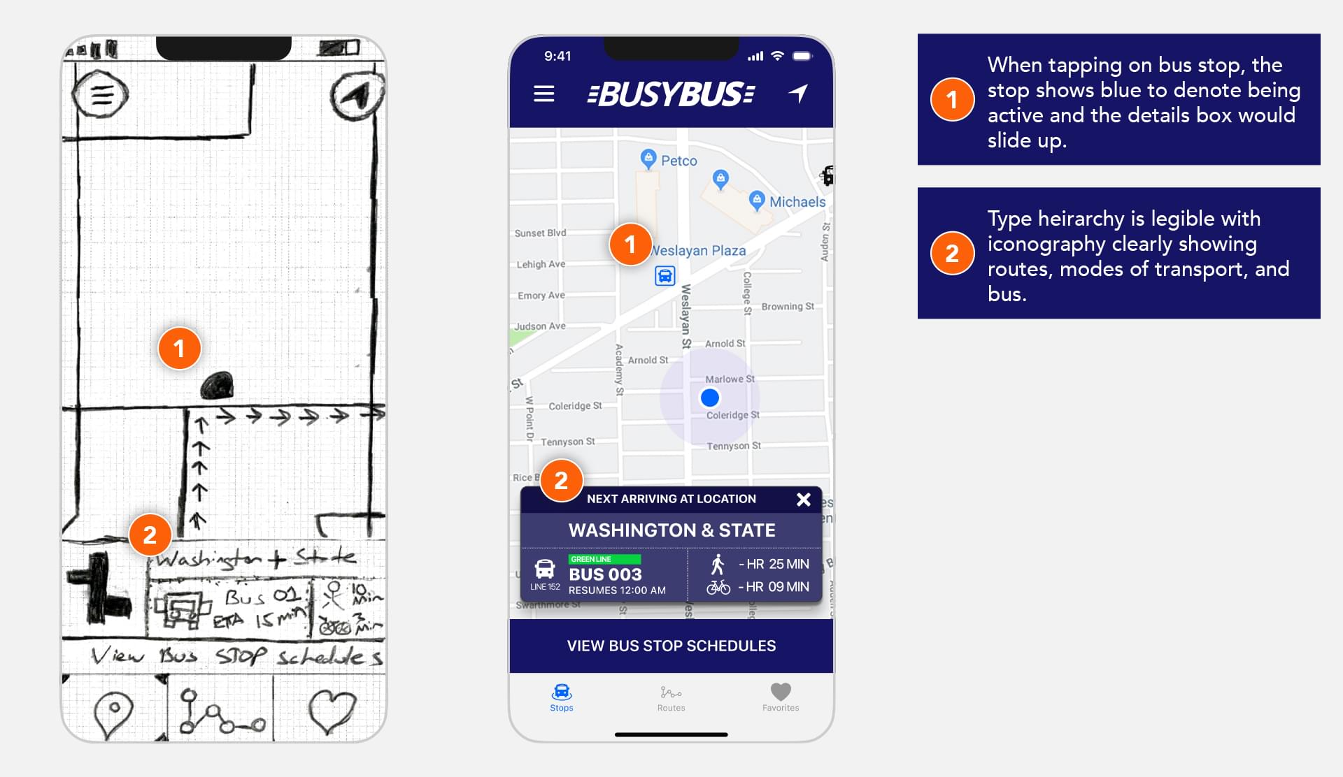
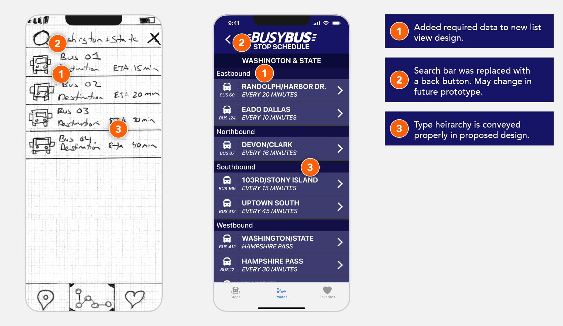
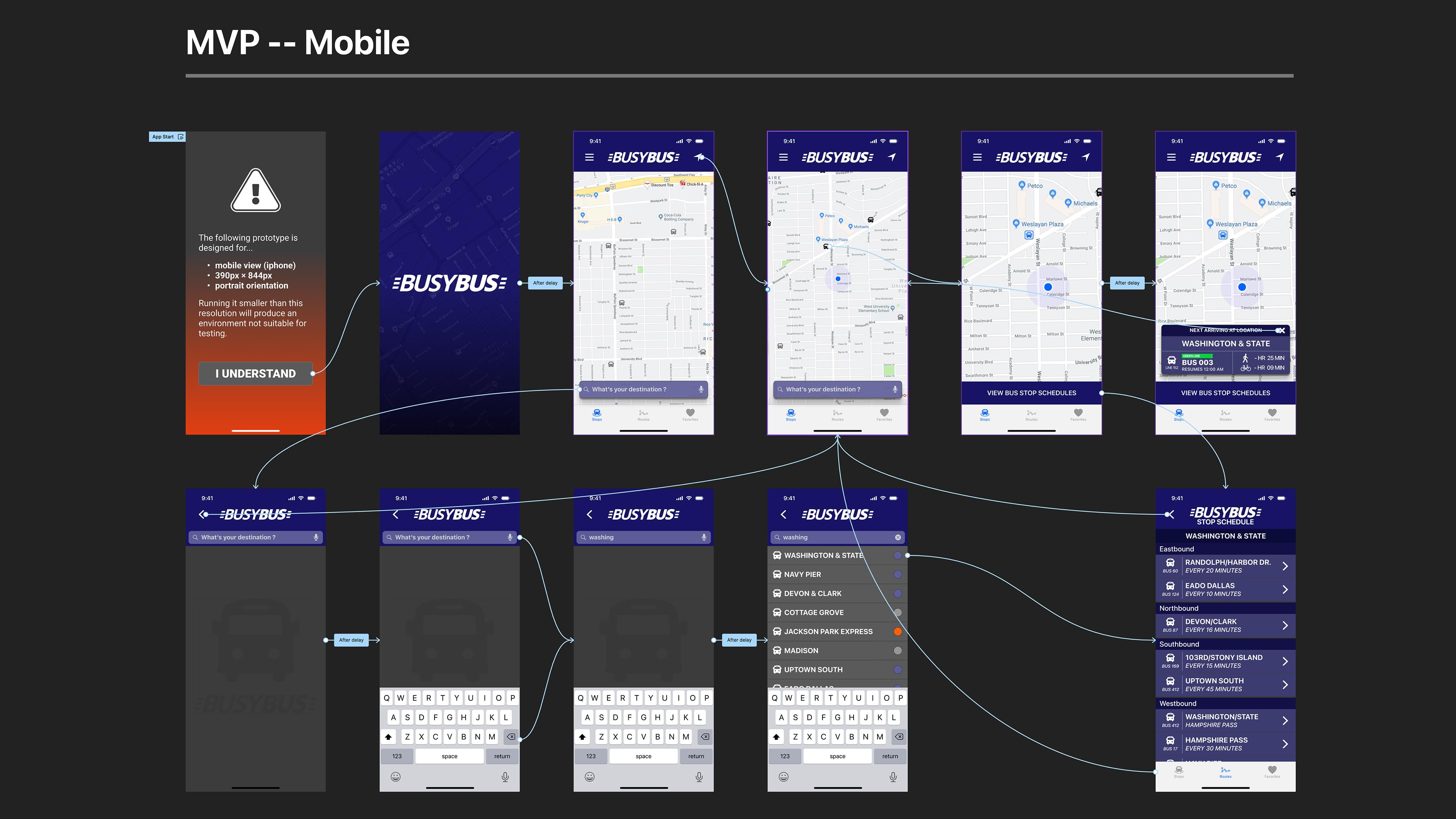
Taking the information from the Usability Test, I developed three high fidelity mock-ups that feature the top three screens that a user would need to see. The information needed to be the main focus, as well as an easy to understand transit map showcasing where on the route specific buses were. Understanding where to give emphasis to important information while still having a clean and enjoyable user experience made organizing the design much more logical.
I kept the design clean and monochromatic so the information would be the focus of the overall design. Clean navigation and information hierarchy make the app easy to use and understand and minimal use of iconography help the user quickly know where their bus is, how far away and how long it will take by other means of transportation.


Prototype was designed for viewing on a Desktop computer only. Viewing on other devices might show unintended results.
Usability Test
The testing of the paper prototype was done with three subjects in person. This was my first experience using a script to conduct the interviews. Each participant had varying experiences with technology but all had mobile phones and all were understanding of using apps in their day to day lives.
Tasks
- Pull up a map that shows the locations of active buses.
- Figure out bus locations relative to me.
- Find and favorite a specific bus route/schedule.
Since there were only three screens used there weren’t a lot of varying opinions of how things worked. The sessions were productive as I asked the participants to speak their mind while they were tapping through the different scenarios. Other than suggestions of future enhancements to the app design that were out of scope of this project, there were some UI tweaking that was suggested that I took into account when constructing the final mockups.
User Feedback...
- Users preferred having a persistent tab bar at all times so they could easily tap back to Home.
- Users preferred having a polished UI to interact properly with the prototype.
- Users preferred polished iconography to further assist in successfully navigating the prototype.
Future To Do's...
- Be less verbose in my scripts for future usability tests. It took longer to interview the participants than to do the tasks.
- Try to provide users with more helpful expectations instead of potentially interfering with the tests with my feedback during the tasks completion.
High Fidelity Prototype
Code Development
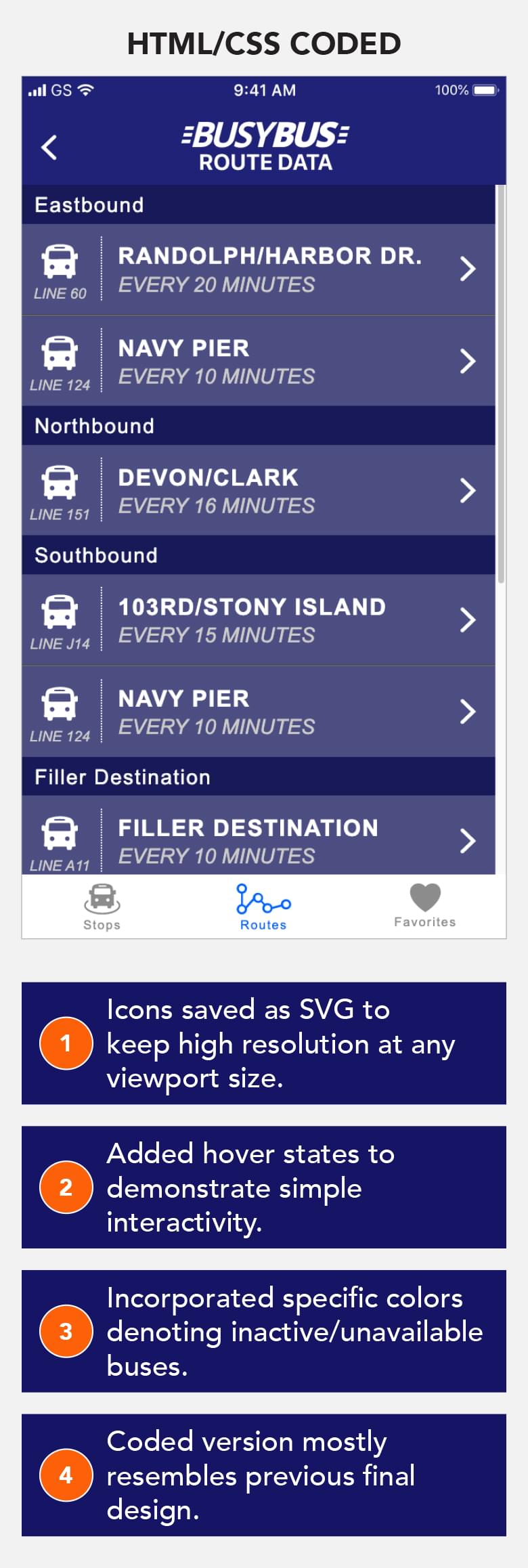

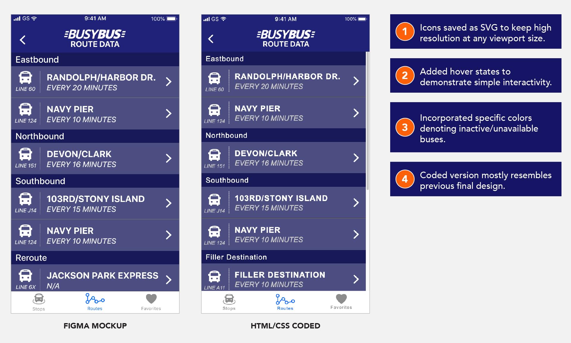
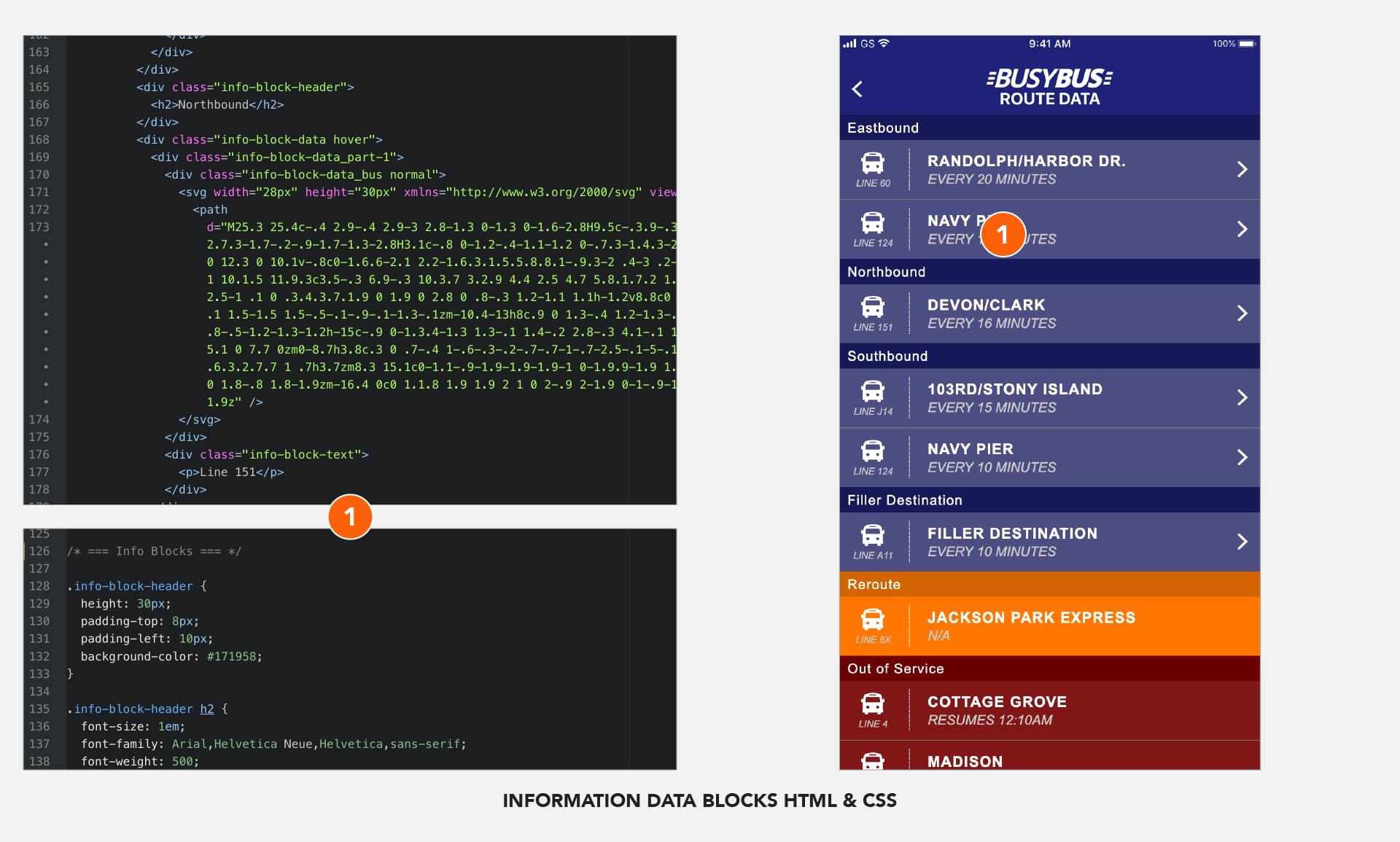
To finish off the design I needed to complete a coding exercise and visually code the Route Data Screen. Specific colors were used to visually show the status of each running bus.
Having previous coding experience allowed me to work through some previously taught concepts as well as trying out newer technologies such as Flexbox.


Prototype was designed for viewing on a Desktop computer only. Viewing on other devices might show unintended results.
Solutions Statement
When working through the stated problem, I knew the solution needed to feature clear data and information that the user wanted to know and have it be as up to date as possible. Utilizing a simplified design process, I needed to get an understanding of how current riders look into information such as scheduling and locations. This information and a competitive analysis of the space gave me valuable direction that was used to create my solution. User Test results helped to guide the end product into something that was clean, visually easy to read and clearly displays the information that the user needs to know.
MVP Prototype
Project Retrospective
What Worked?
Being one of my first projects, I had to trust the process to deliver a product that solved the set problem. Knowing I had a limited amount of time to complete each part gave me a good amount of frustration. I am grateful to the group of individuals that helped me get through a very awkward user test, as I only had three sketched screens to go through and a lot of visualization needed to be done on their part to progress in a positive manner.
What Didn't?
I would have benefitted greatly from having a more in depth requirements gathering discussion. Unfortunately, working with a simple written brief without the ability to ask questions to narrow down the problem, restricted my ability to confirm I was on the right track. I believe in constant communication with my team, both to challenge me and to confirm my assertions, when working out a design problem.
What Surprised You?
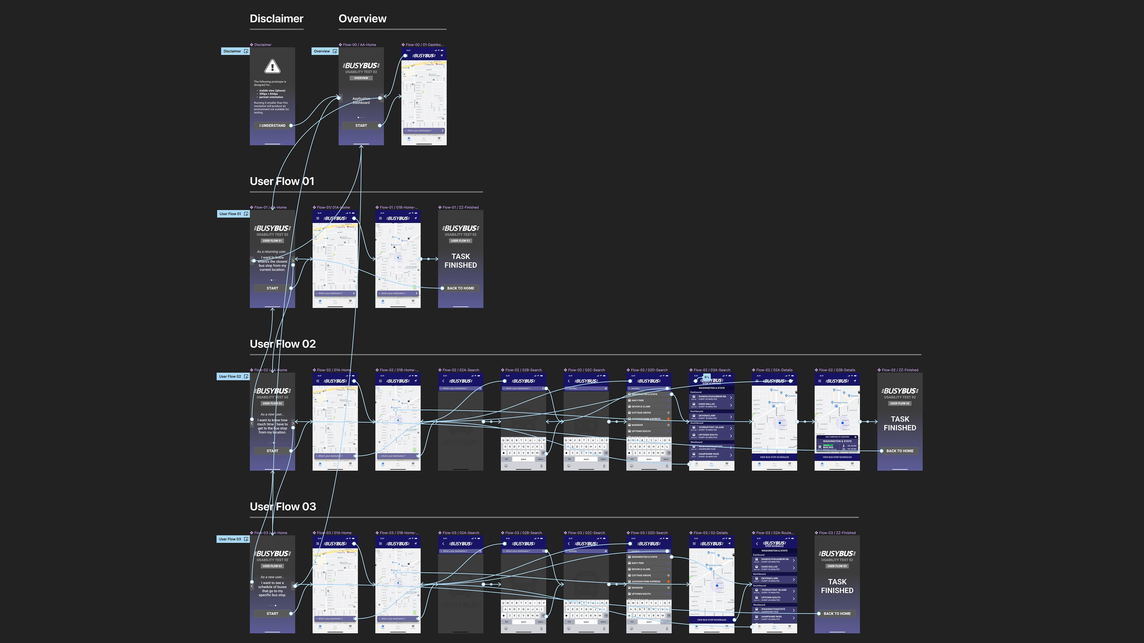
The amount of difficulty trying to get a viable solution out of a three screens. Since there was no requirement for User Flows in this assignment, using them would have given me a visual aid on how I would go from one action to another. I believe this would have allowed me to work faster than sketching different screens and trying to refine them down to the required amount of three.
Bottom Line Takeaway
BusyBus was my first introduction to the UX Design process. It helped me understand how complex research done early on can help with the decisions made in the design solutions throughout the project. I learned that it’s critical to have input at every milestone, allow for correction if necessary, and to be open to all types of feedback. Even though this project was very specific in what was expected, it made me excited for future projects where I could utilize the full process to discover solutions to a simply complex problem.
