UI/VISUAL DESIGN
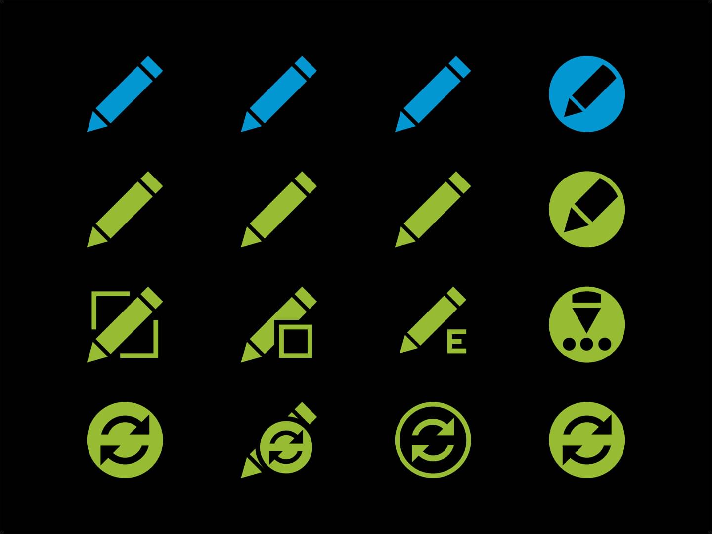
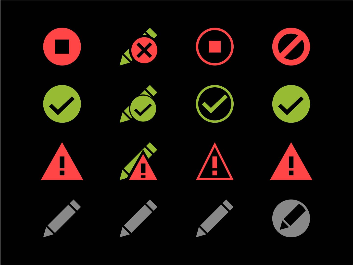
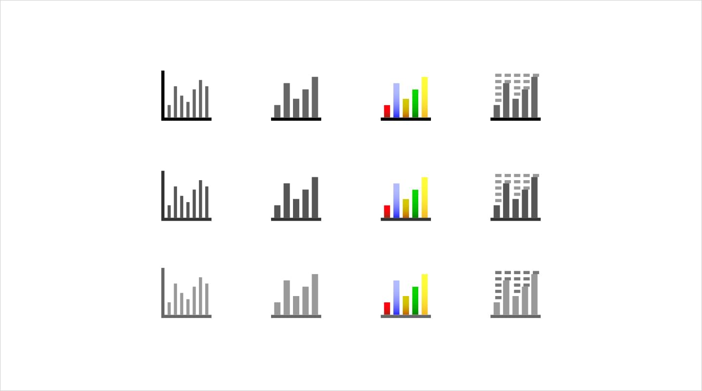
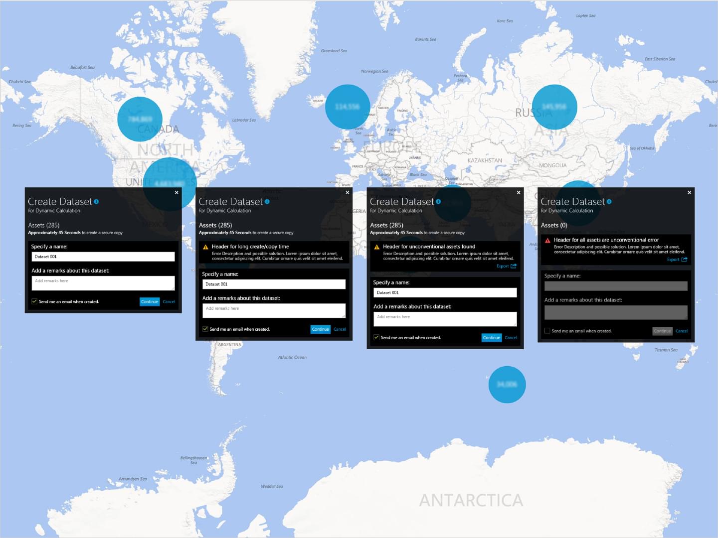
IHS: Query Status Icons
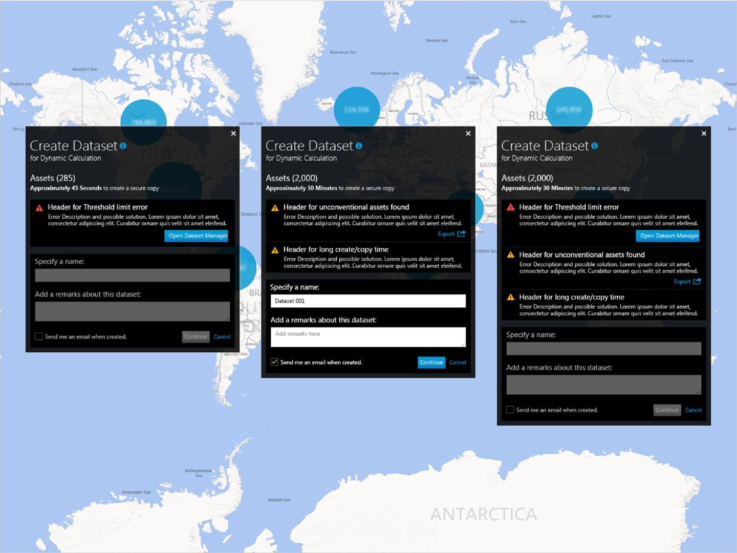
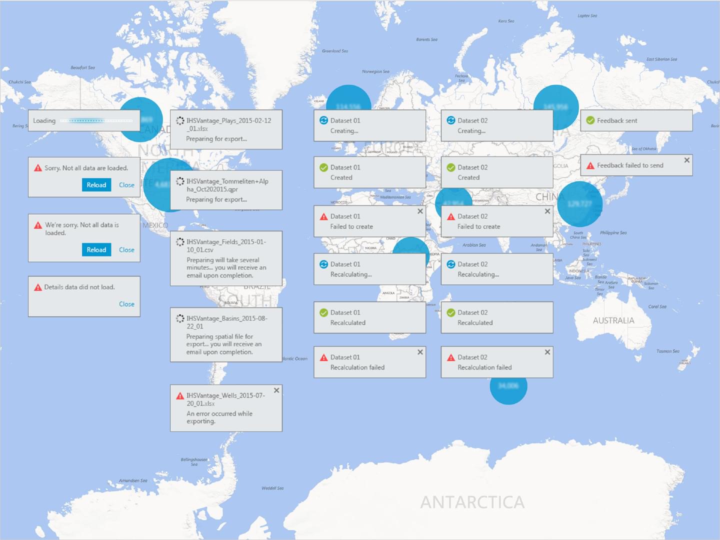
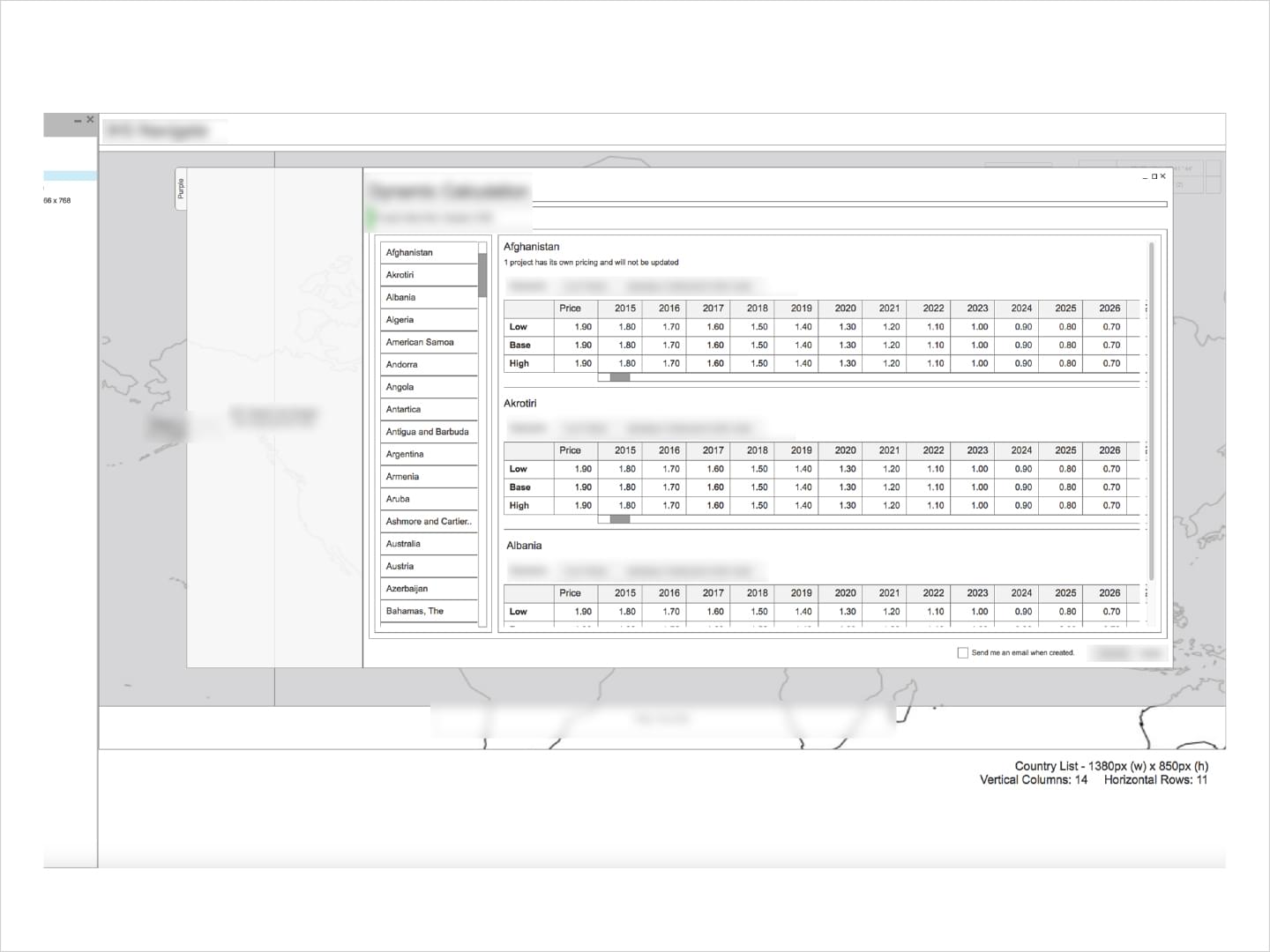
These icons were created to show the different states a user would encounter entering different asset queries using the Dynamic Calculations feature. They would change based on where the user query was in processing.
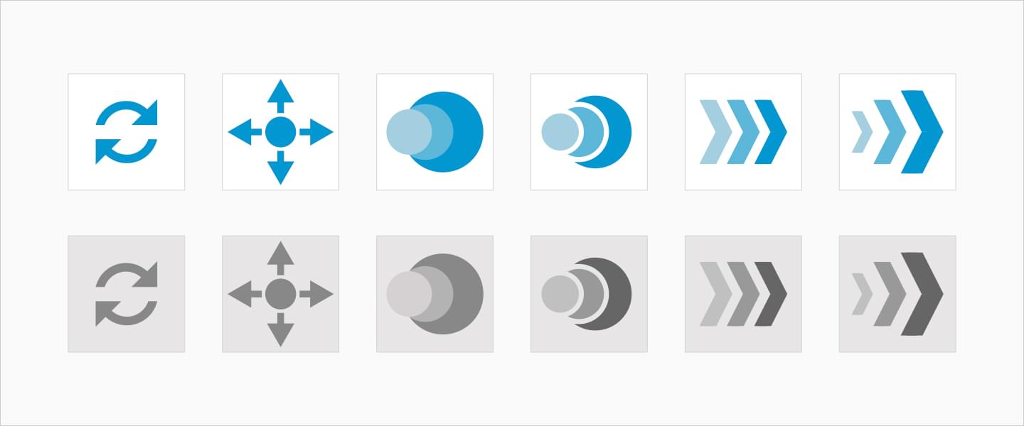
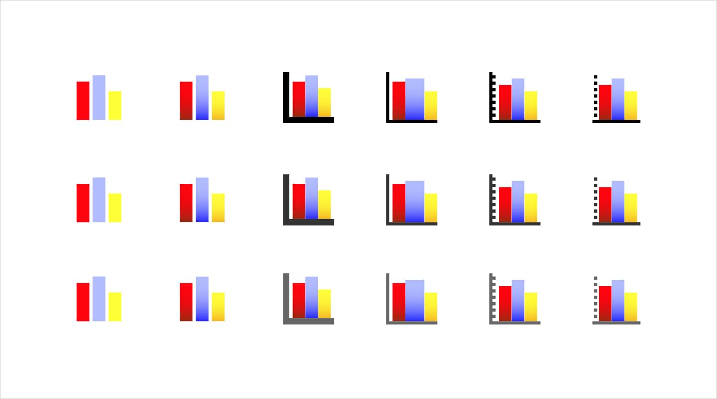
IHS: Variable Pricing Icons
These icons were designed to show the active and disabled states for both Real and Nominal calculation buttons. They would change based on the users submitted query.
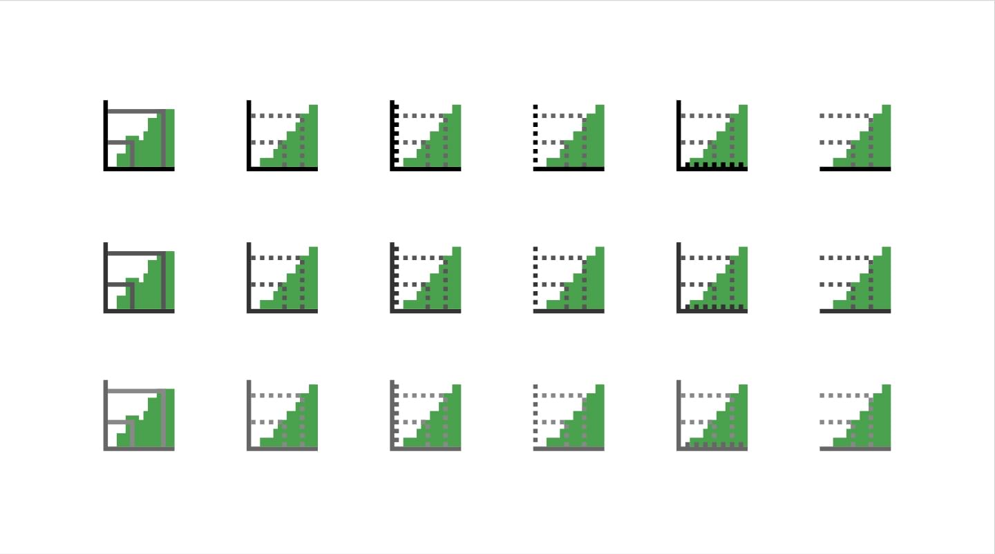
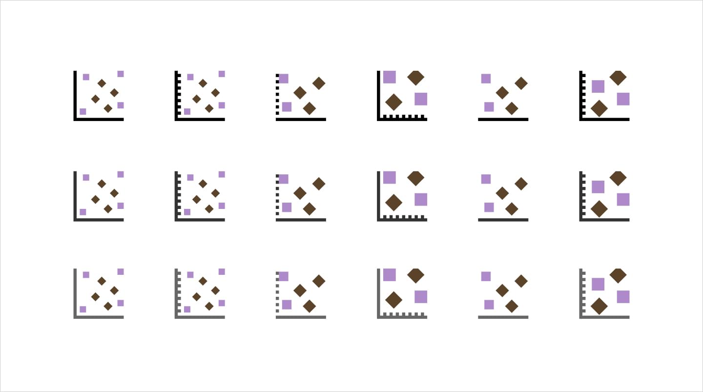
IHS: Chart Plot Icons
These icons continued the established design style of the interface within Harmony. They convey the Cross Plot, Cumulative Plot, and Histogram buttons.
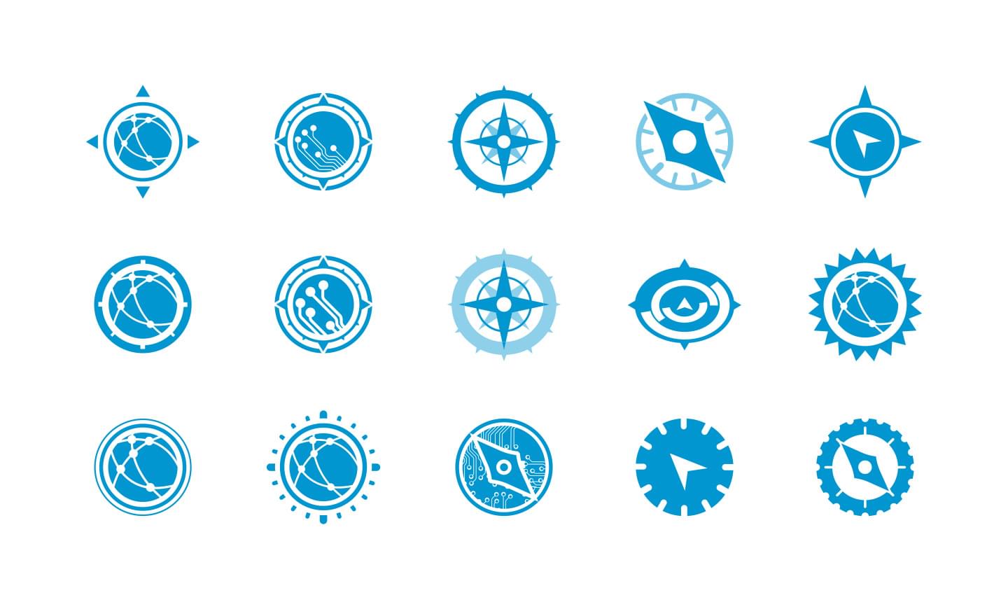
IHS: Product Identity Icons
Icon concept designs that were created for product identification for IHS Meridian products.
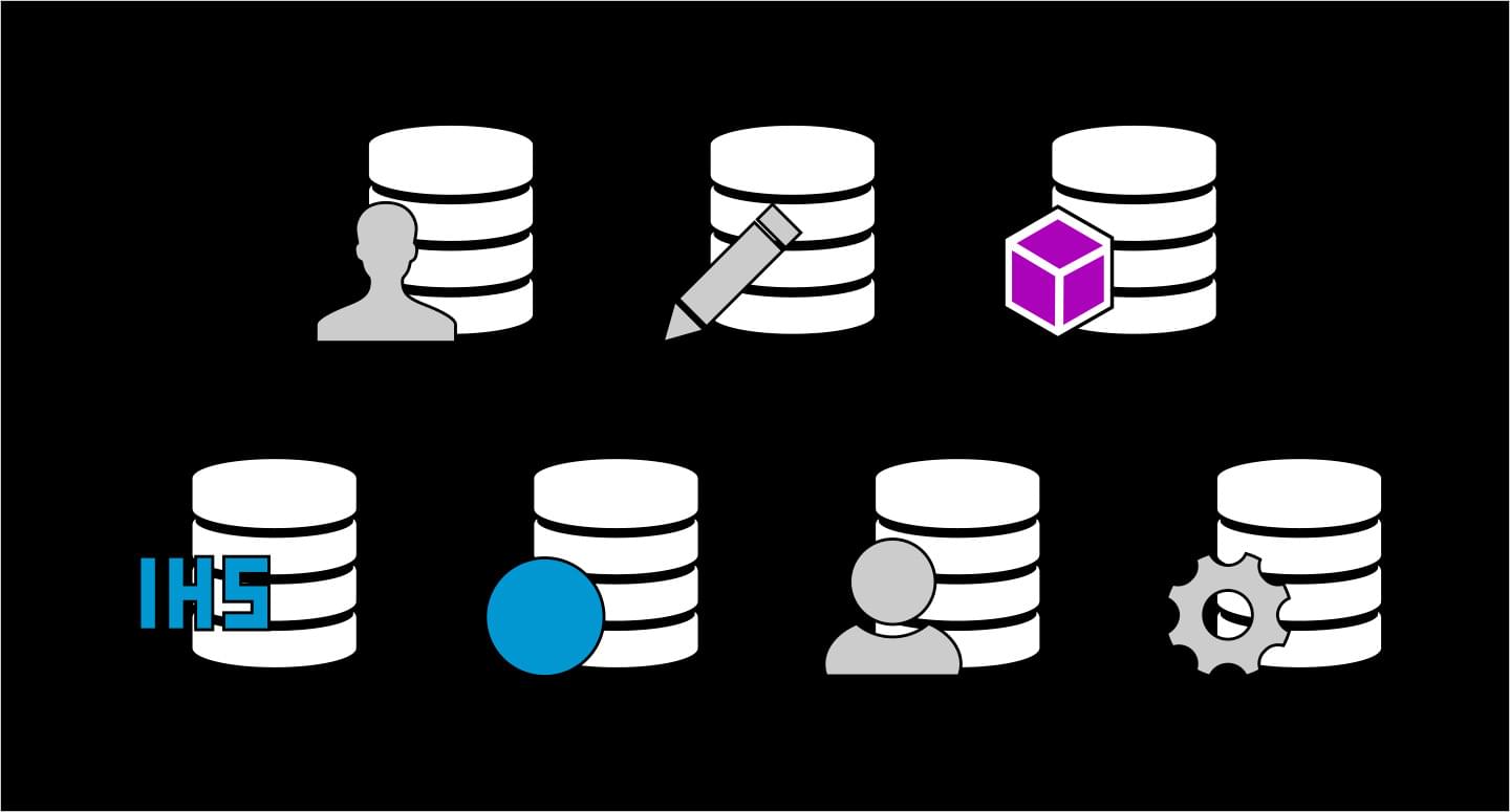
IHS: Dataset Launcher Icons
Custom status icons created to specify between a user created or default IHS dataset. At a glance the user would immediately be able to recognize the type of dataset they were working with.
IHS: Component Libraries
These different sets of UI components were created and standardized to be distributed to the team for reliable consistency when patterns were used in mockups. Responsive viewport sizes were also taken into consideration.
IHS: Tab Design Exploration
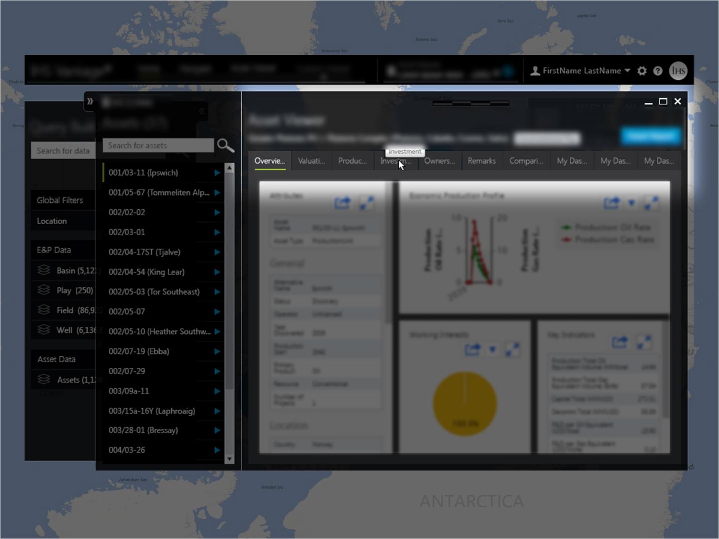
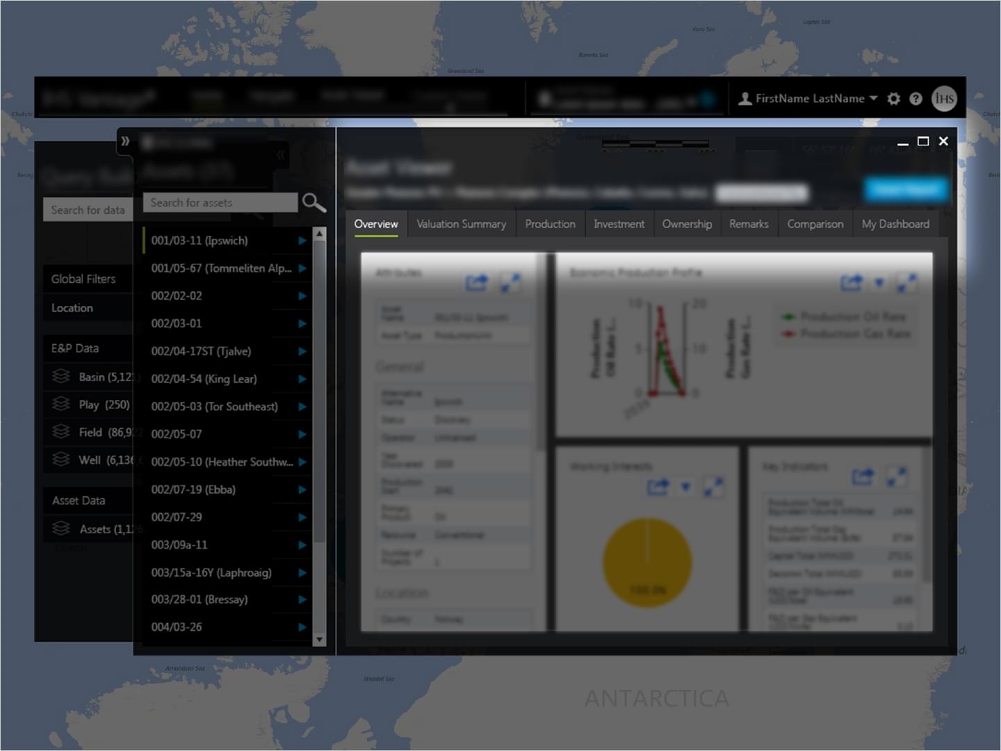
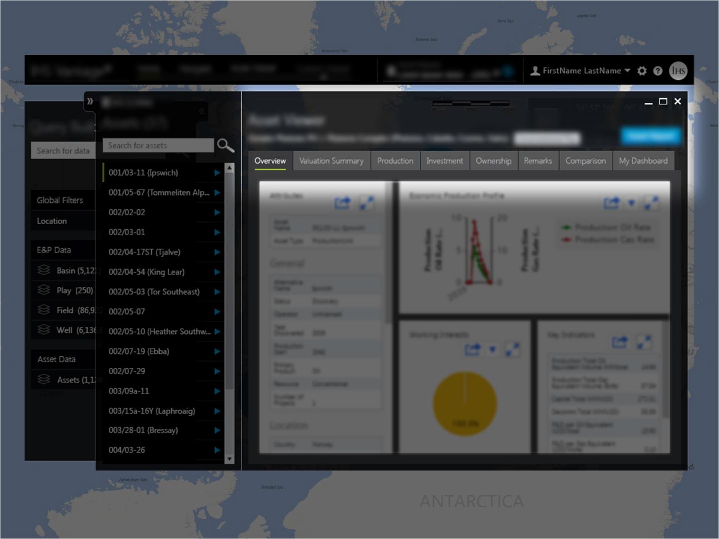
These mockup concepts were created based on the need to address issues with current design of tabs while adding minimal code changes by developers. The main challenge was to balance new design value against developer implementation time.
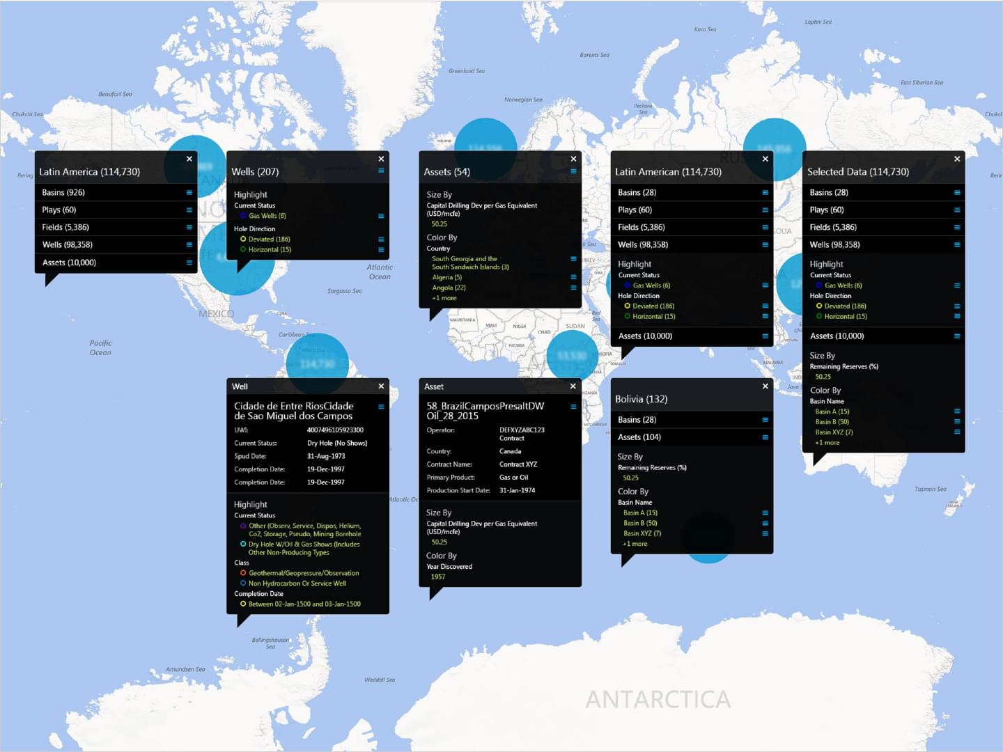
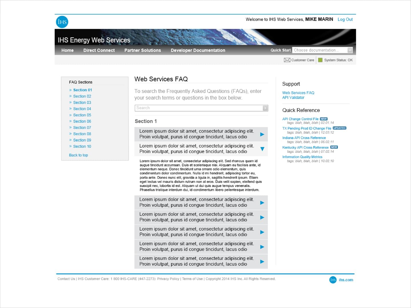
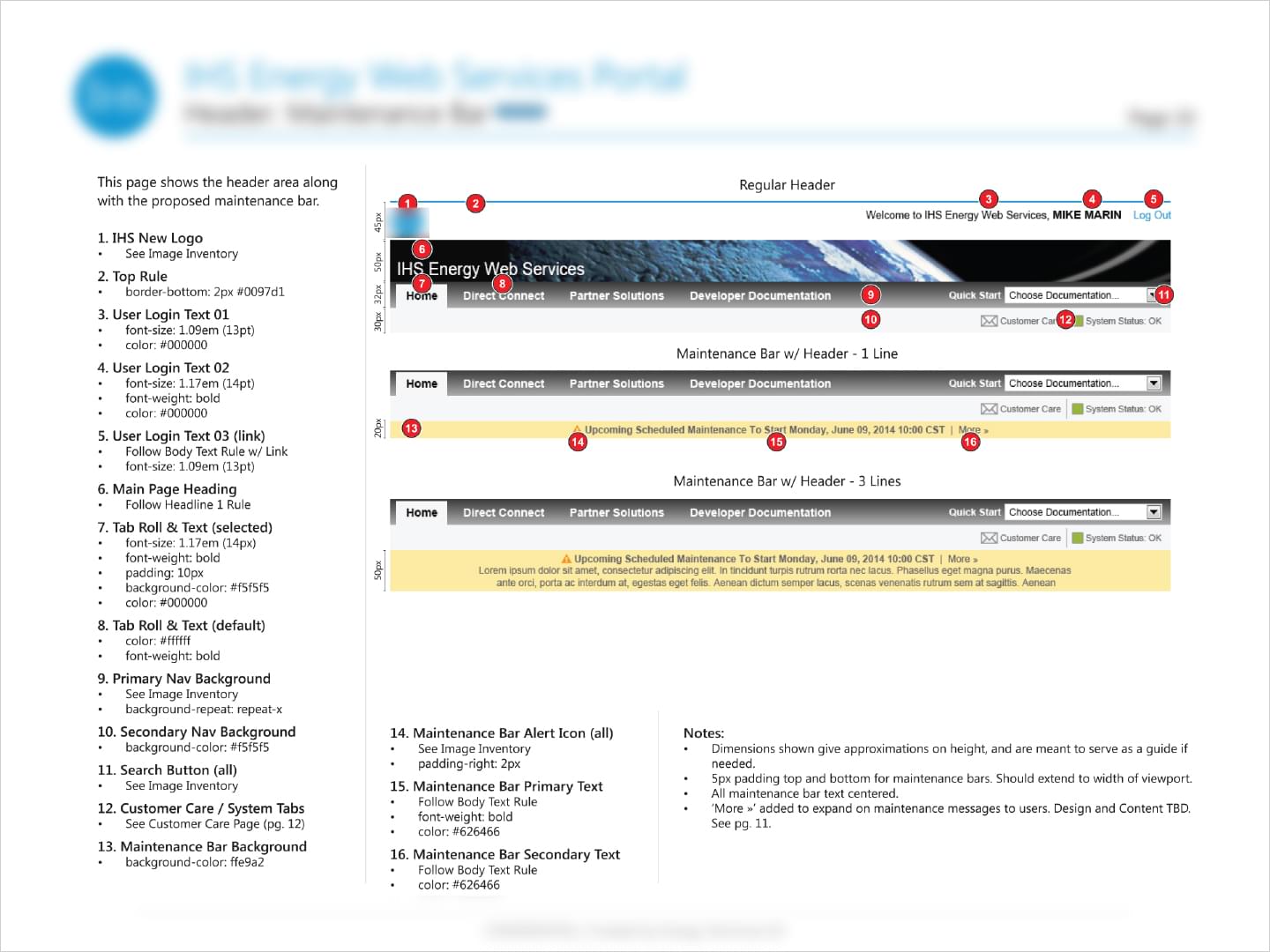
IHS: Web Portal Design
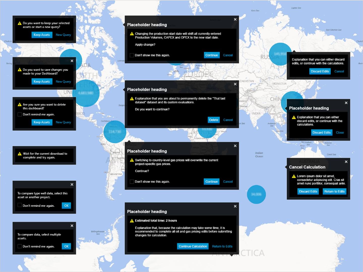
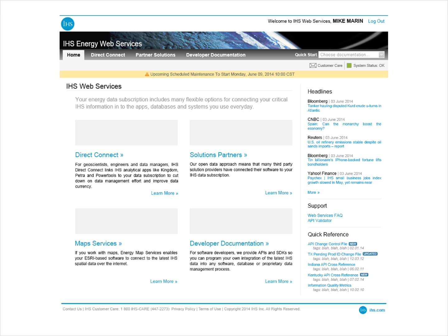
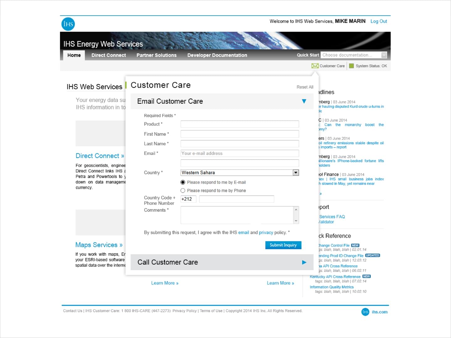
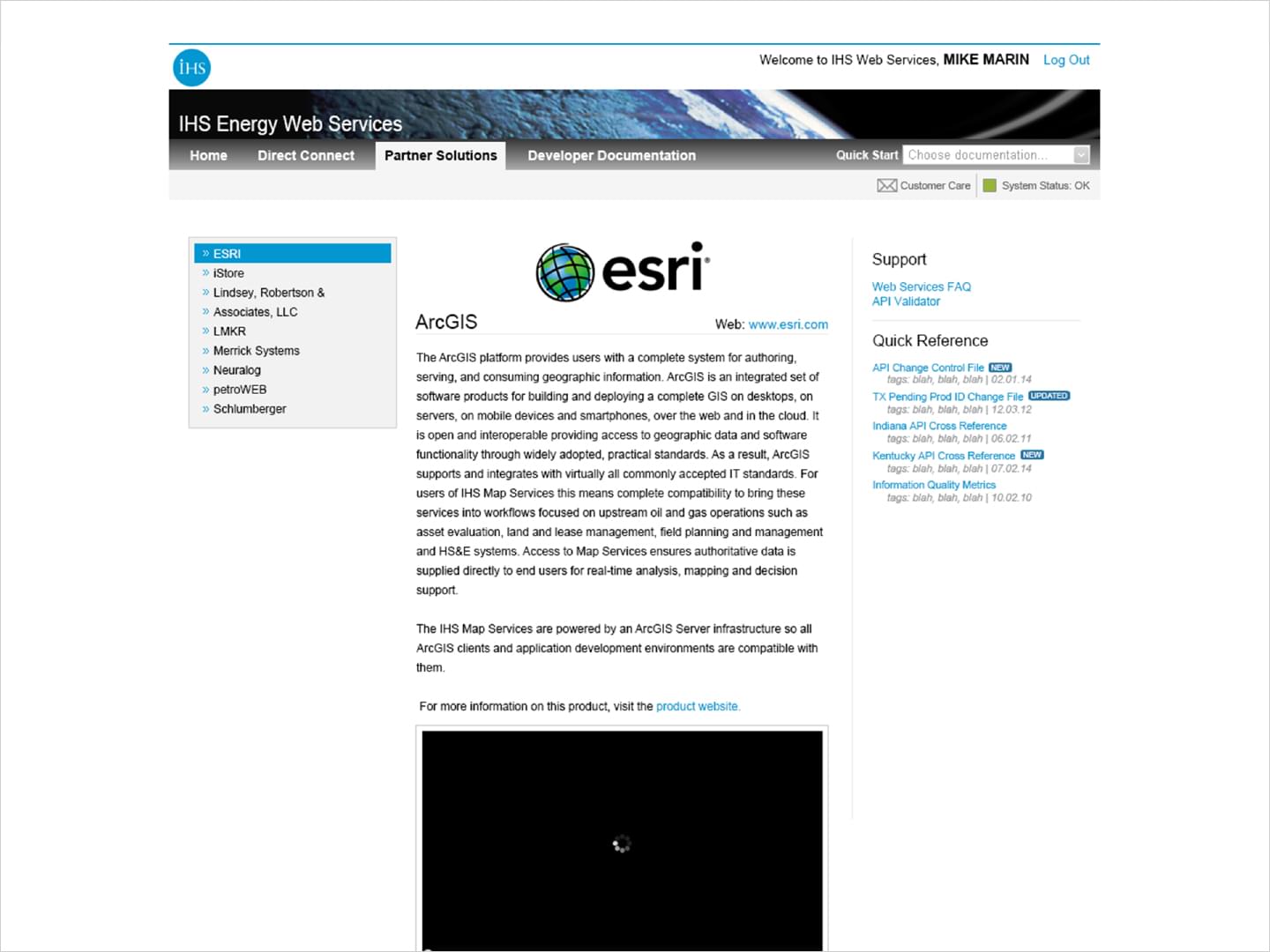
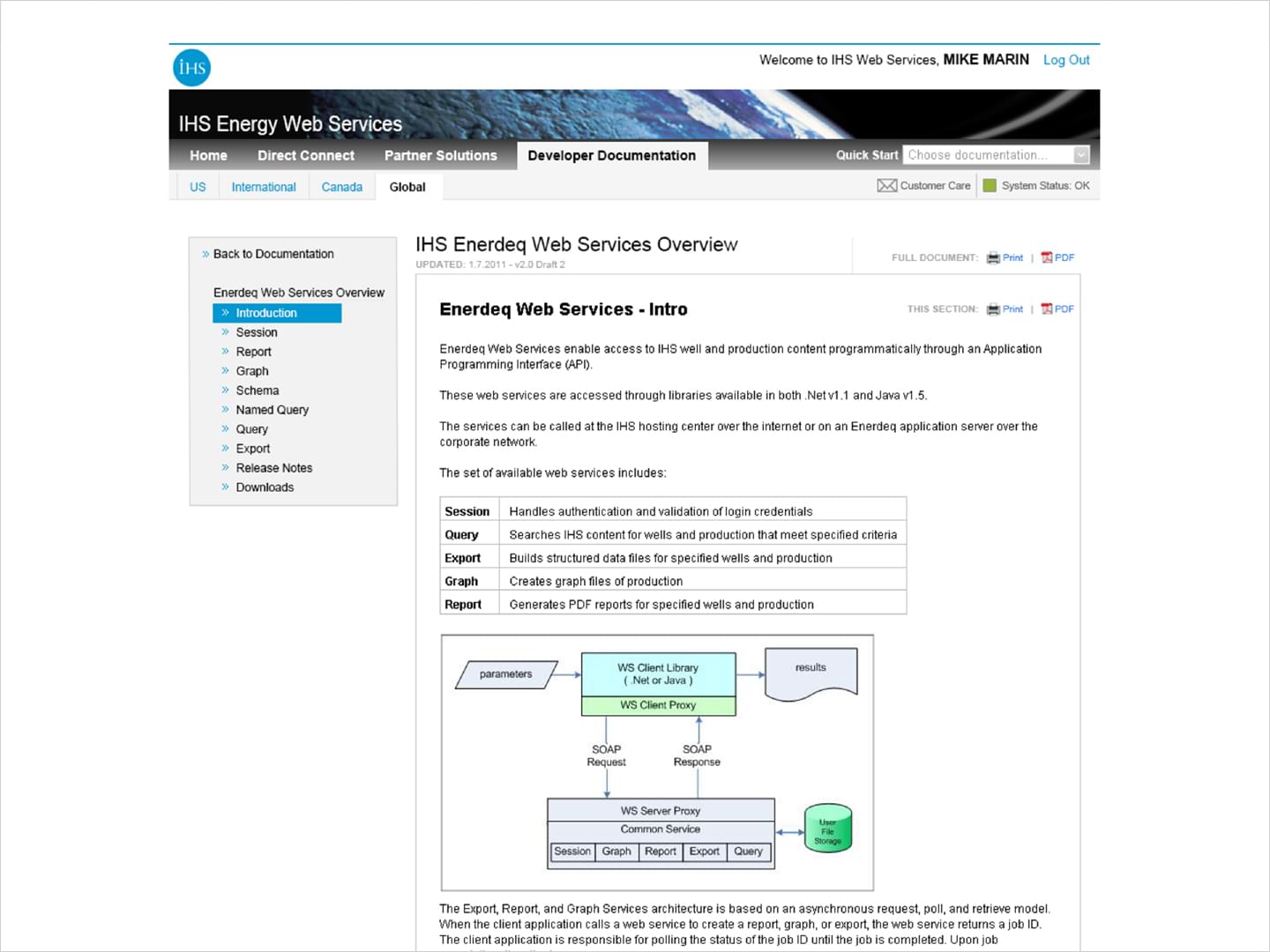
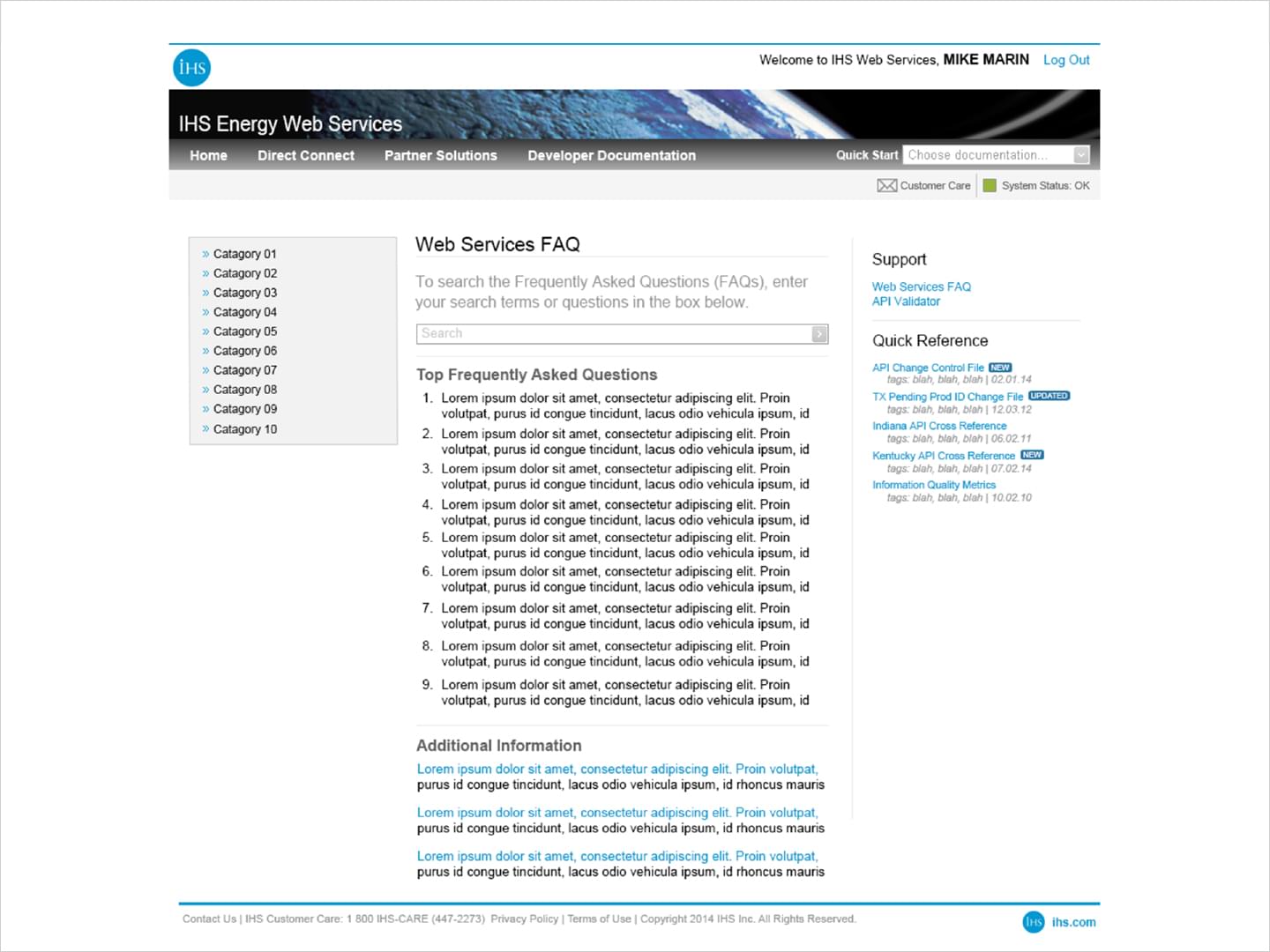
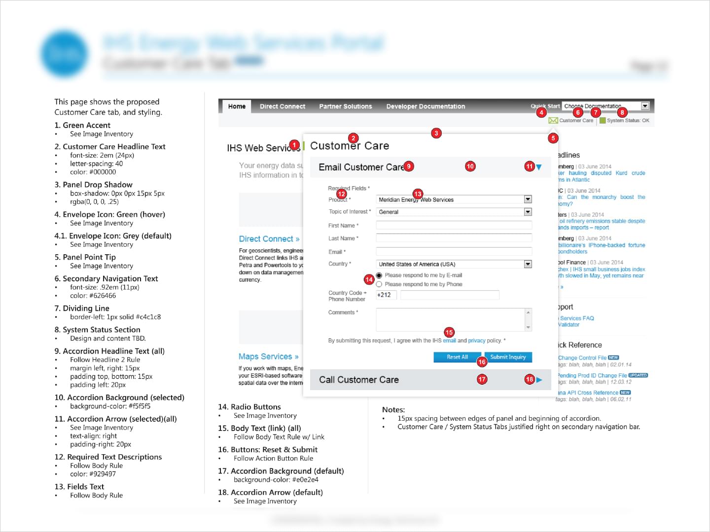
These mockups were designed to add new features to the current WSP framework while also implementing new branding updates. Modeless alerts, easy reference sidebar, service status indicator, and a revised customer care tab were among other changes proposed in mockups.
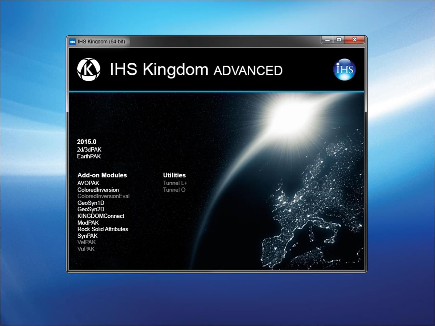
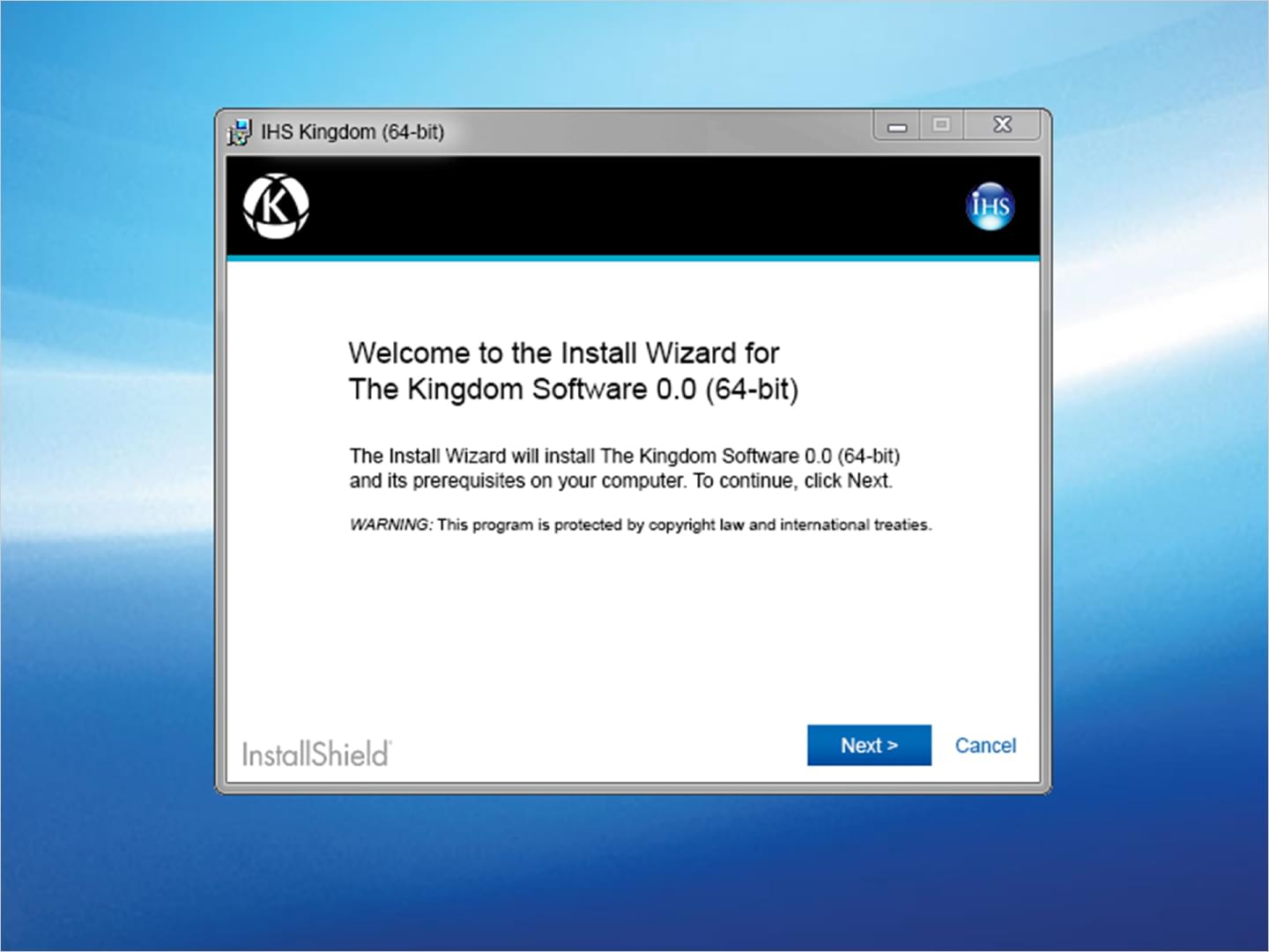
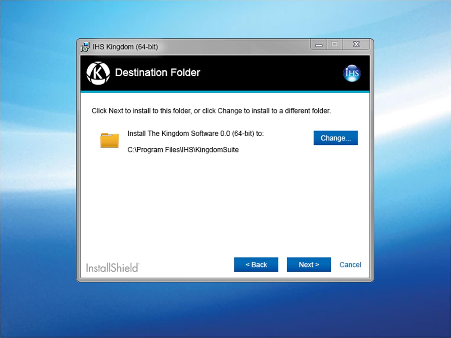
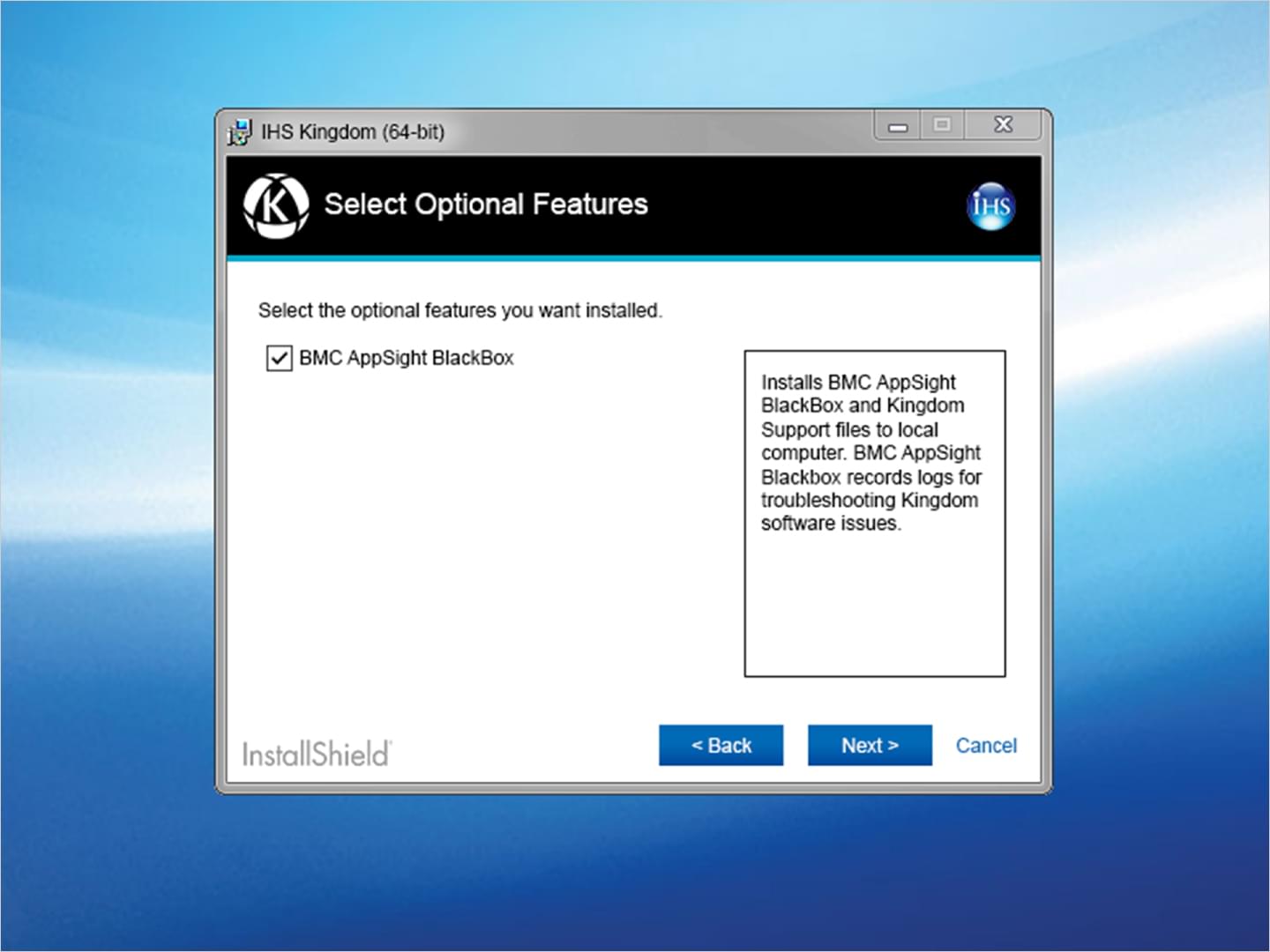
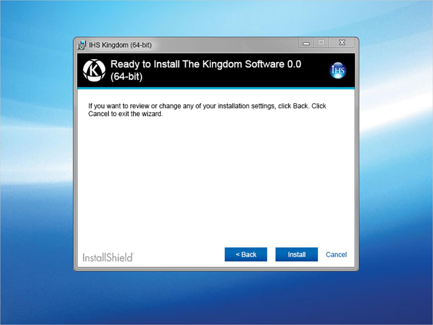
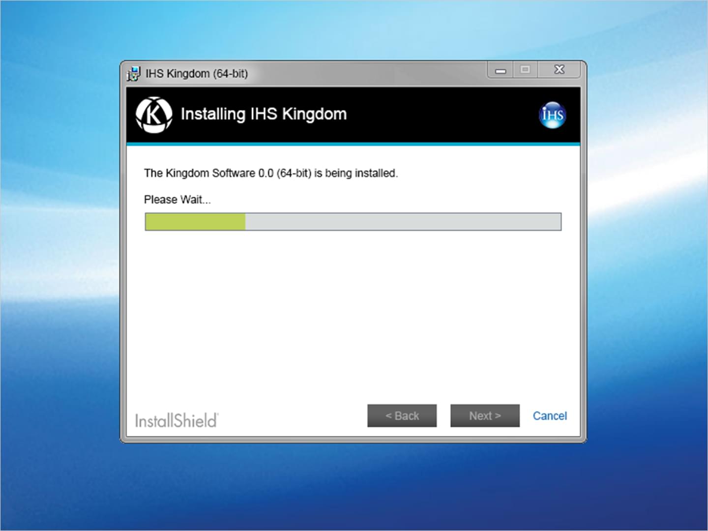
IHS: App Install Screens
These screen mockups were meant to show new changes in design and branding to the installation and splash screens of IHS Kingdom. Visual styling was meant to be consistent with other IHS Meridian products.
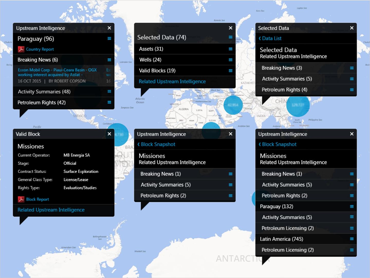
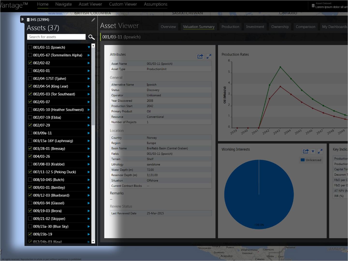
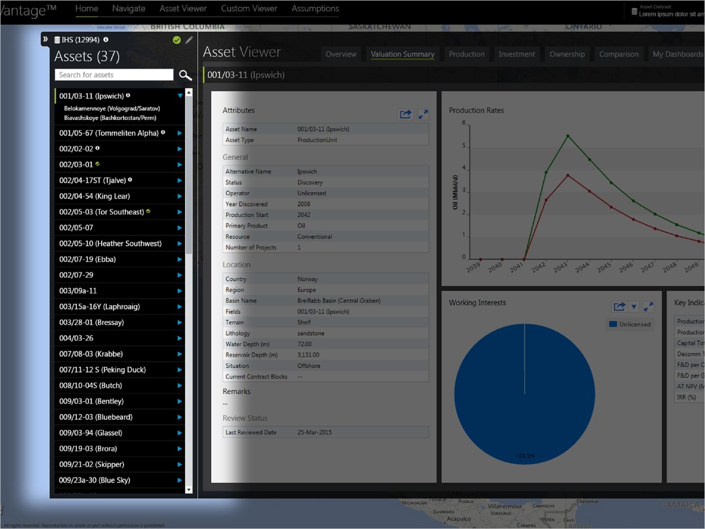
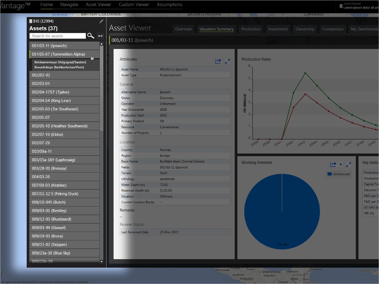
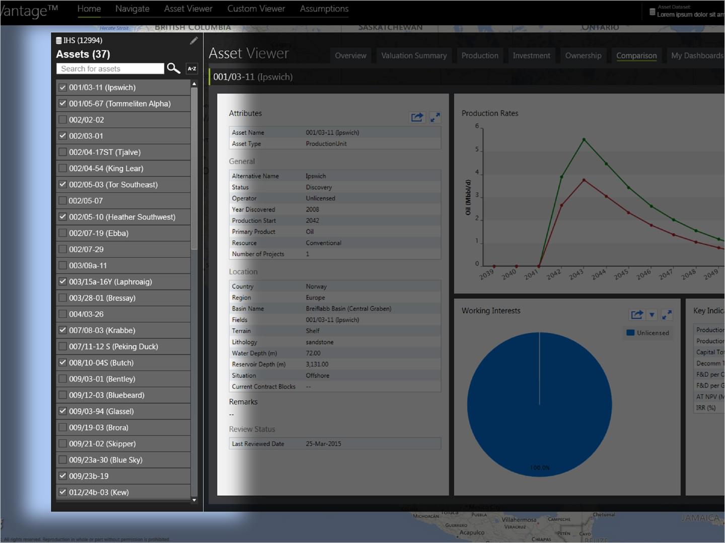
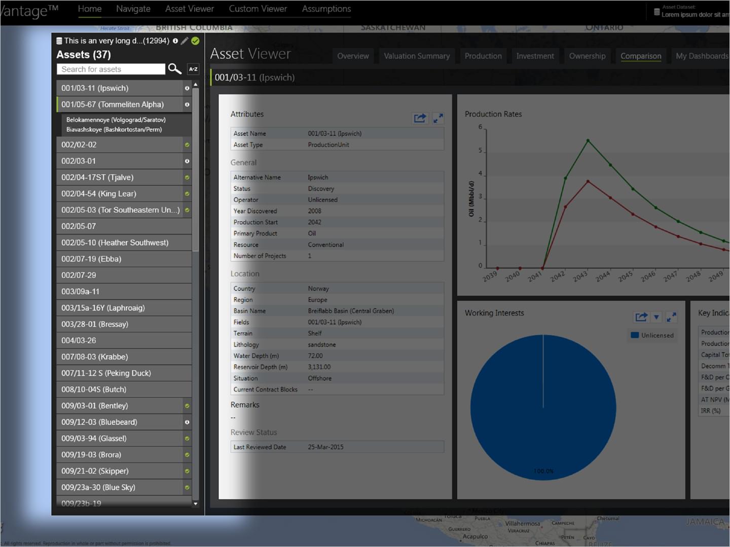
IHS: App Viewer Updates
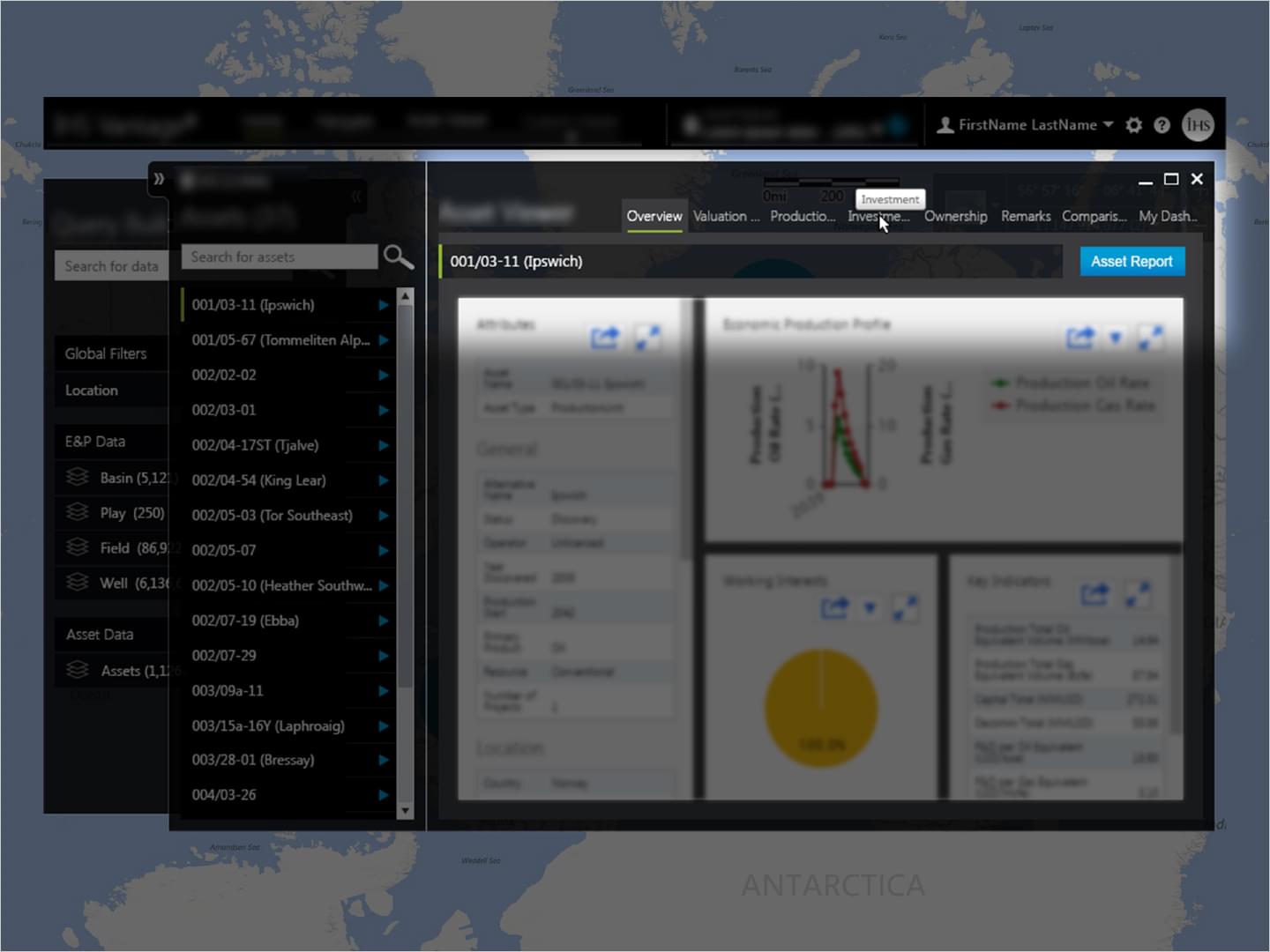
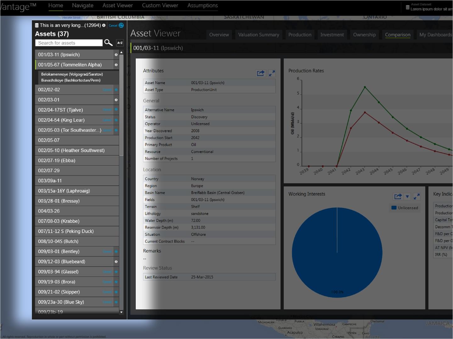
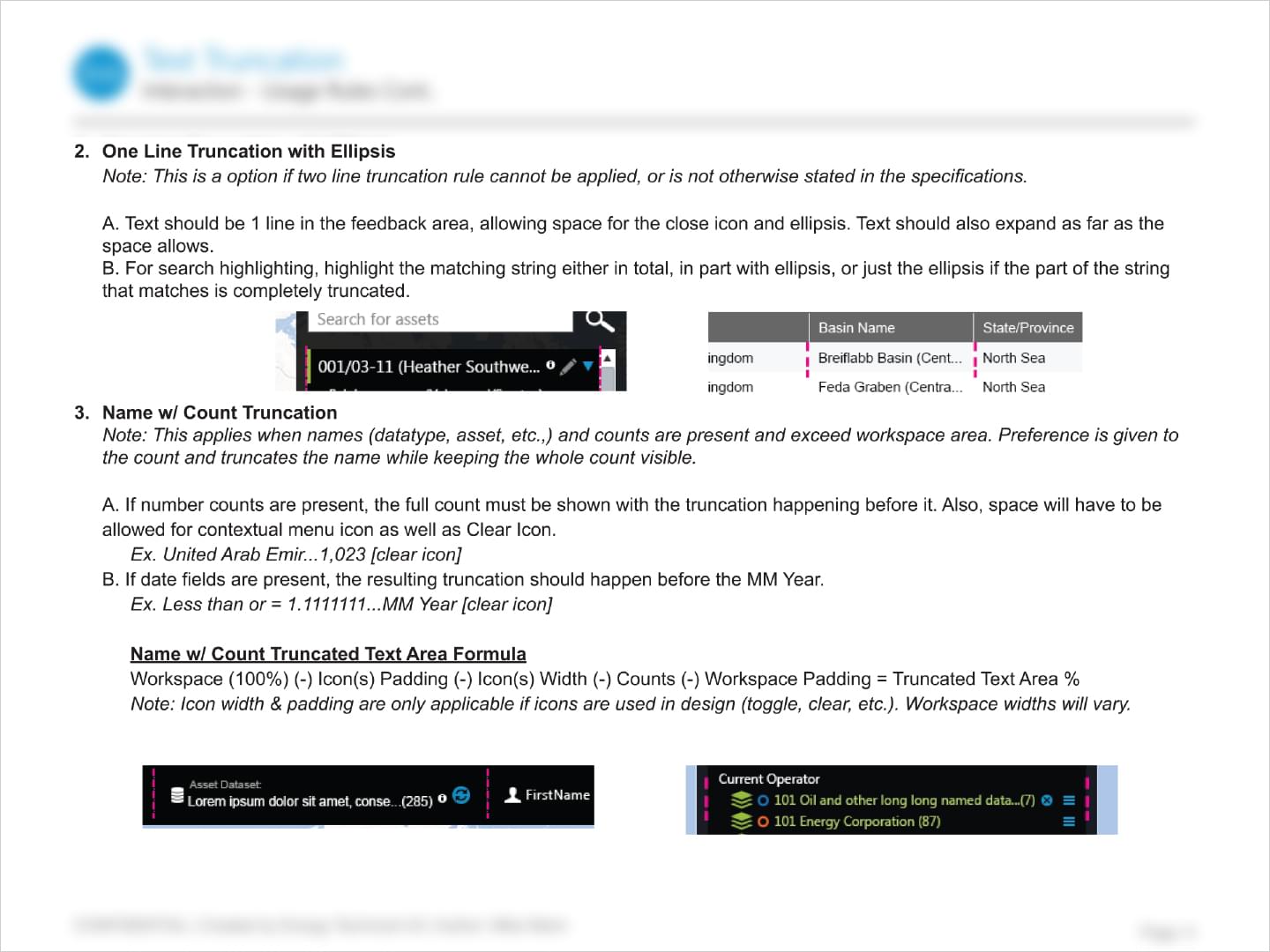
These concepts were made to show different styling applications to the framework of the Asset List. The designs allowed for usage of superscript style icons along with considerations for name truncation and icons that already exist in the current design.
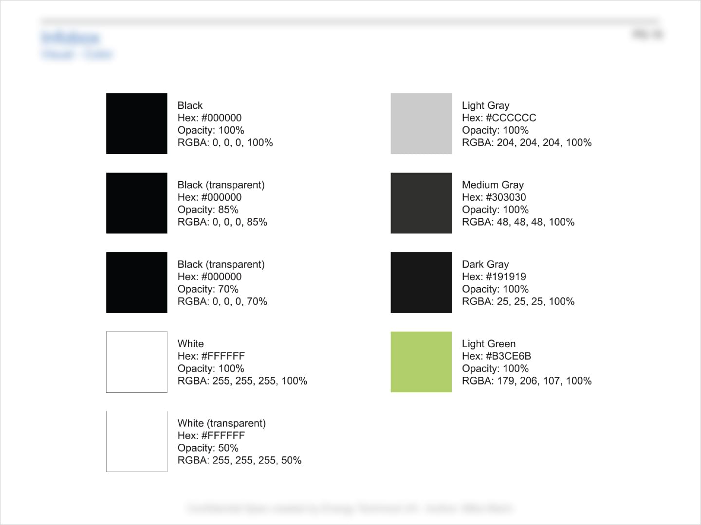
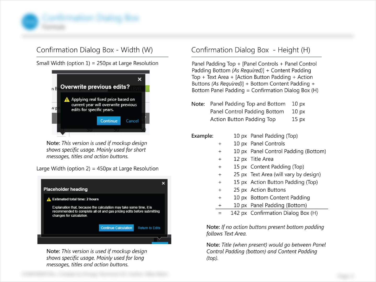
IHS: Visuals Documentation
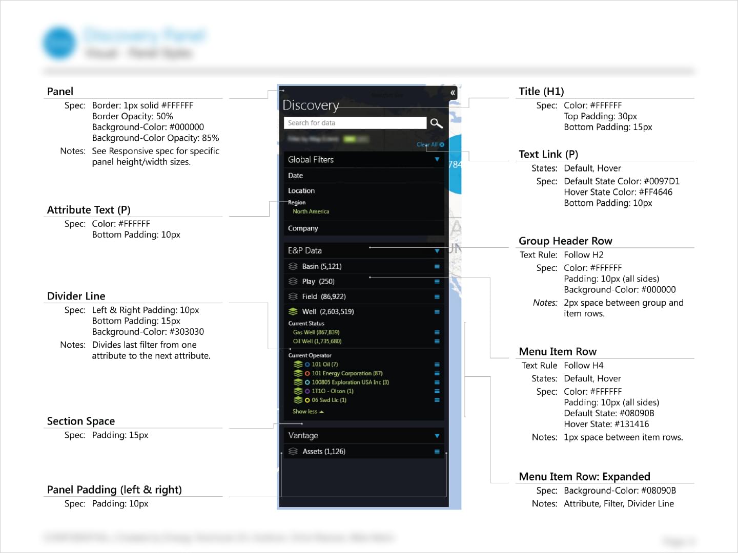
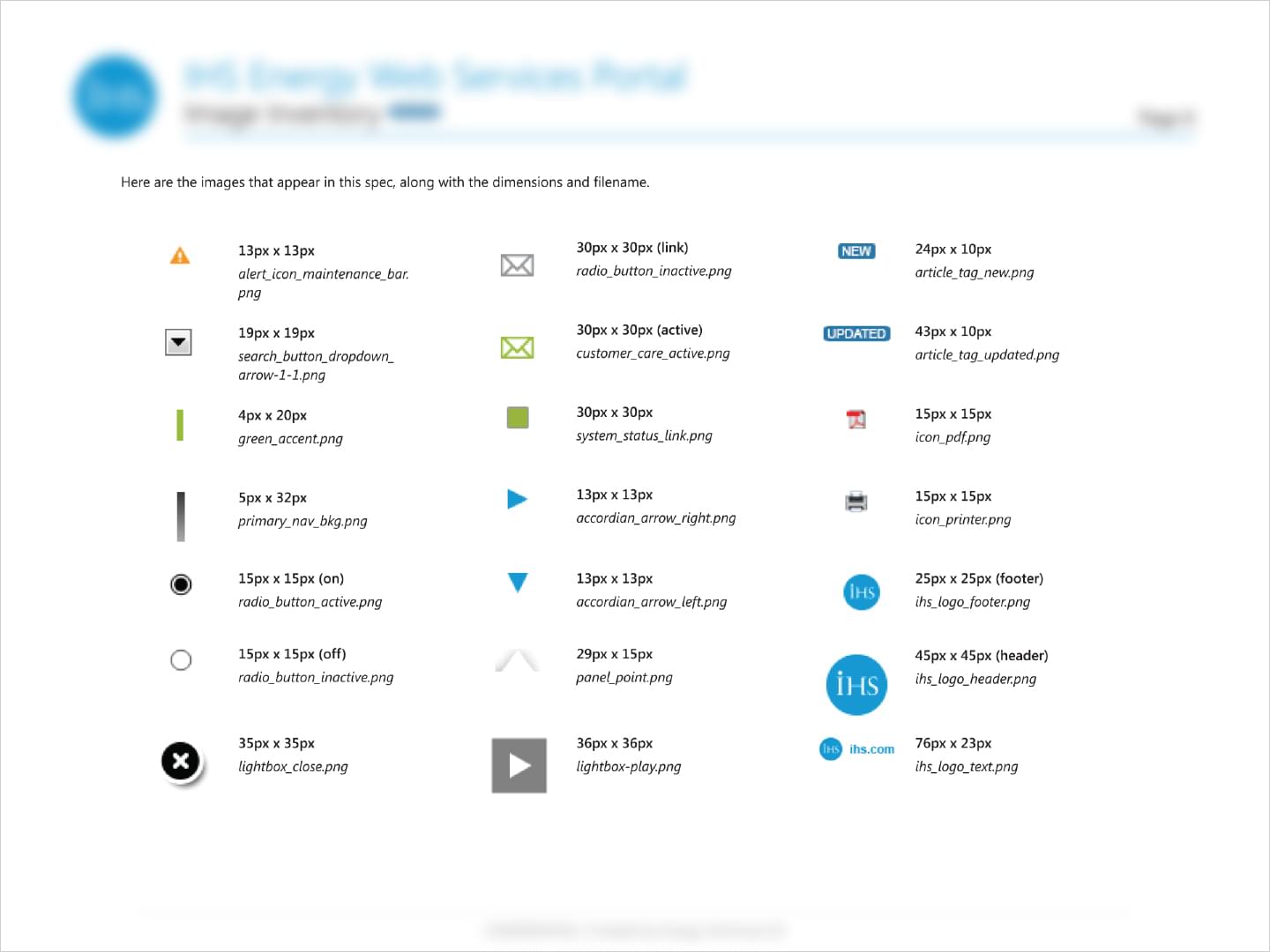
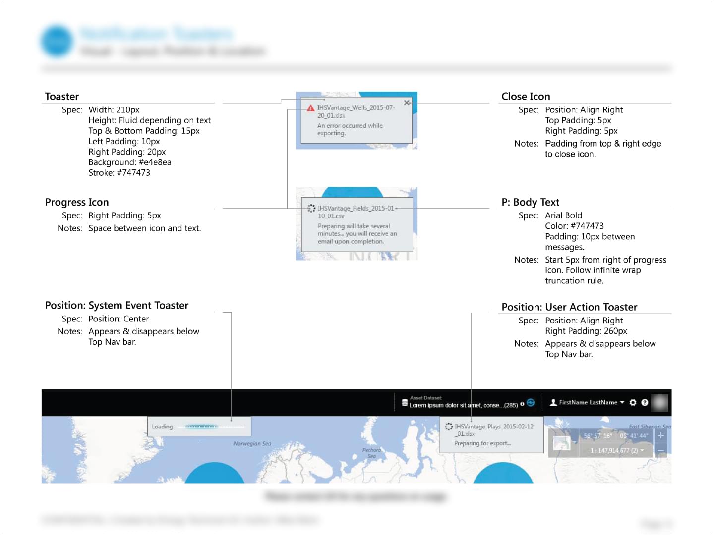
Working with different team members located around the world, visual specs would be created to add consistency to designs. When a new feature/component was designed, these specs would be referenced to make sure mockup designs closely matched coded implementation.
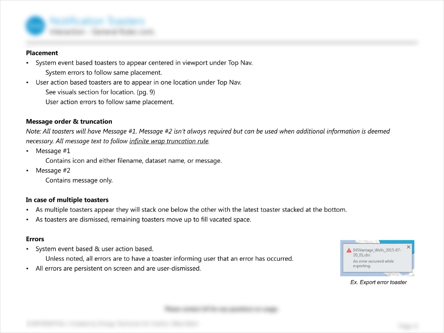
IHS: Rules Documentation
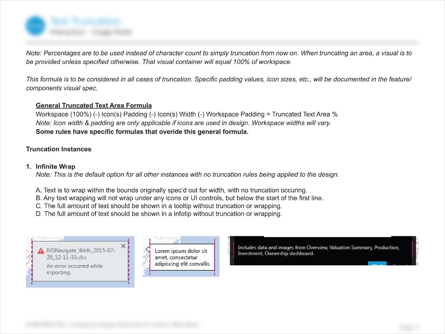
The creation of internal documentation within the UX team was meant serve a variety of tasks. Internal documentation included everything from UI inventories that showed how UI components were used with the application, to rationalization documents that proposed how to simplify the approaches currently used. Interaction Rules documentation were meant to be shared with developers to indicate what rules & behaviors the features that have been prototyped should follow within the application.
IHS: App Feature Prototypes
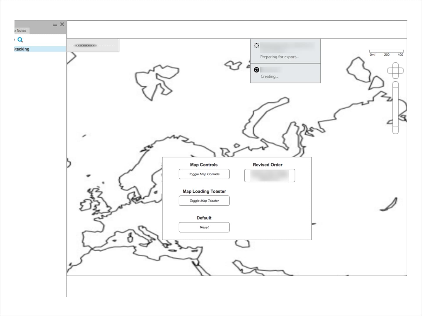
Designing workable App Feature Prototypes early in the design phase helped visually work out workflows and potential issues without much investment in high fidelity assets.
